.png.ed69a7260a477fcf4feead7a0e4b7506.png)

Victor
-
Posts
28,214 -
Joined
-
Last visited
-
Days Won
267
Content Type
Profiles
Forums
Events
Articles
Everything posted by Victor
-
This is the worst thing I have ever had to do.
-
fuck we have Fong now?
-
-
The Los Angeles Stars are pretty bad. It's been a while since we've had a team quite as bad as the Stars are in S93. If they lose their remaining 20 games, which is not a long shot given they've only won 3 of their first 52, they will tie the very bad S11 Toronto Legion for the most losses of all time. If they get fewer than 2 points between now and the end of the season (again, within the realms of possibility given they only have 7 so far), they will have the outright least amount of points a team has ever managed in a single regular season. What stands out about this Stars team is that they're probably not the worst roster the VHL has ever seen. With 81 goals to date they are the ninth-lowest scoring team of all time but will probably get the extra 2 goals to escape the bottom 10. They're nowhere near the 400+ goals against that some historically bad teams have conceded in the past, including S81 D.C., who were tanking during peak meta era. But because the rest of the league, except Davos, is on a very similar footing, there's a lot fewer opportunities for LA to pick up points around the league than if there competed in the unequal seasons of VHL's past. Coupled with being the VHL's least successful franchise as of today, this season may well be the nadir of the Stars' existence so far.
-
Week 2 of 2
-
trailblazer Interesting, it feels like the original seven are untouchable at this point but NY has to be the easiest to cull if we truly want something fresh.
-
The anti-Sydney sentiment of all those not from Sydney is always amusing. Bern is gorgeous though, as is most of the country tbf. Same for Australia... I need to move
-
The Bears simply do not do fringe playoff team.
-
Is she here?? Do we have a Carson family situation? Or does she just proofread your work?
-
EU top five in historically close race for playoff seeding
Victor replied to scoop's topic in VHL.com Articles
There's a way to see historical midseason standings?? -
Eagles soaring
-
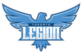
Re-Branding a Perennial Disappointment: The Toronto Legion Story
Victor replied to dstevensonjr's topic in Media Spots
top tier profile picture Mr Skinner -
Halfway through the season, the VHLE standings have split into half between the contenders and pretenders. After a lot of parity to begin the season and unexpected wins by the teams expected to struggle, notably defending champions Bratislava, three teams have managed to separate themselves from the pack and are in a close race for the top. Cologne, off the back of four straight finals, looked to be running away with the regular season again but a surge by Vasteras puts them just five points behind. Oslo sits just three points behind Vasteras. These three teams are also home to the six highest-scoring players in the league this season and most of the league's top goaltenders, with the exception of Stockholm's Kaskiniemi-Kekkonen. It seems clear that, barring a huge upset, the Renaissance Cup will be heading to one of these three cities at the end of the season but what impact will winning the King's Cup have? Will it increase the pressure or will it help having an easier first-round matchup in the playoffs? Lots of storylines still to unfold in the E.
-
Teno and Summers all timers
-
I guess we have to eliminate you then
-
@Beketov triggered
-
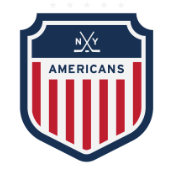
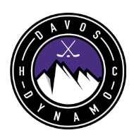
To decide what franchise is most in need of a rebrand it makes the most sense to look at how old each team's logo is. After nearly a quarter-century of VHL seasons of teams slightly modifying and re-using existing logos from other leagues and sports, since S24 all logos have been original, some designed by the VHL's own graphics community, and most of the more recent ones being purchased from third-party designers. Quite a few continue to stand the test of time. Let's count them down. S81: Riga The newest logo in the VHL belongs to the Riga Reign who avoided a rebrand for nearly 60 seasons beforehand and are only on their third logo overall (all variations of the orange lion). I think this one got quite widespread approval and is certainly an upgrade on the previous version so it would be unlikely to be changed any time soon, even as a big change is about to take place in Riga's GM position. S75: Calgary Another long-awaited change to an old franchise's appearance took place just six seasons previously, as the beloved derp horse was retired after 50 seasons to make way for a more imposing stallion. The Wranglers have also only gone through three variations of the red horse and the current version is likely here to stay for a while. S73 expansion teams: Chicago, Los Angeles, London, and Warsaw S68 expansion teams: D.C. and Prague S65 expansion team (Moscow) and S66 expansion team (Malmo) I am grouping all the expansion teams together (which is actually half of the league) for a specific reason: unlike the rest of the teams' logos, these were purchased using the league's donation money with the thought process that these were long-term investments and won't be replaced on a whim in the short-term. Of course, these expansion teams have all been around for at least 20 seasons now but as we have seen with Calgary and Riga above, and indeed many more examples to come, this is far from a long time in VHL terms. Just as importantly, these are actually a solid set of logos, most of which I think there is no great clamour to replace. The exceptions might be LA and London and purely on a personal level I think LA is the franchise most in need of a fresh start but I'll let someone else dive into that topic in more depth. S53: Helsinki The Titans aren't far off from being joint-oldest on this list as their logo change in S53 was only a cosmetic one really, polishing up and slightly recolouring the version they got in S24 when all teams rebranded to in-house made logos. However, given Helsinki did give themselves an uplift 30 seasons later, they fall in the midtable of this list. There's nothing that needs improving for them but maybe they'll want another small makeover in the near future. S52: New York The next three logos are a tale of how logo changes can sometimes seemingly alter history. The Americans had lots of success following the S24 rebrand and were arguably the league's most successful franchise in the following 30 seasons. However, just before their back-to-back championships of S52 and S53 they swapped to this logo and after that initial short-term success.... well you guys probably know most of the story. One finals appearance has followed in the 40 seasons since, so if there's any franchise that needs a rebrand just to dump their loser era it's New York. S47: Toronto In a similar vein to the Americans, the Legion's logo swap immediately led to threepeat, the first of its kind. It's been a bit of a rollercoaster since but Toronto's logo just seems to work for them and also harks back to the version they used in the league's first decades. In fact, the S47 rebrand replaced a very unpopular logo so this change was welcomed and despite being one of the oldest ones in use now, it doesn't feel like there is much clamour for change at the moment. S44: Davos Until the recent renaissance under Alex, this, even more than New York's, was the league's most cursed logo. The Dynamo were definitely the league's most successful franchise before S44 and then they just stopped being that. I also personally preferred the logo they replaced, although I am biased as I was the team's GM just 5 seasons previously. Davos has turned things around a bit now but it's the third-oldest logo in the league so I say get them to switch it up and leave that cup drought firmly in the past. S31 expansion team: Quebec, now Vancouver Funnily enough, given what I said about the “new” expansion franchises above, it seems to be the fate of expansion teams in the VHL that they are stuck with their logo for life. Cologne never replaced theirs and have been resurrected with in in the VHLE, the Quebec's was considered so good that it survived the move to Vancouver (more of a translation rather than a rebrand). In fact, not touching the logo was one of the conditions for the move being allowed to go through. It is still unique in being a logo designed by the team's GM, in this case founding GM Pavel Koradek. What has changed over time is that this is now the second-oldest logo in the league so perhaps popular opinion could be swayed towards a change. It is such a simple yet effective one though. S24: Seattle Fittingly, the oldest logo in the VHL is in Seattle, also home to the league's (soon to be by far) longest-serving GM. The Bears logo does predate Bana's reign (yes there was such a time) and is the only logo to survive from S24, when all eight franchises at the time got custom-made logos, having survived until then on versions ripped from existing teams. Seattle until then (ignoring their 1-season stint as the Everblades) had used the Hershey Bears logo, swapped to fairly similar one in S24 and haven't looked back since. Time for a change? Maybe under a new GM...


-
Rebranding yourself in the VHL, a collection of stories.
Victor replied to Hogan's topic in Media Spots
I successfully rebranded once and never looked back. -
Moving the Los Angeles Stars but bringing in the Dallas Kings, genius.
-
big moves by da bears
-
Plans were being put in place tbf, albeit not agreed, pre recruitment drive. More difficult to justify now but it will always be the first port of call if the pipeline dries up, as was always intended.
-
Phoenix Chicagoes would be my vote
-
Correct
-
And the Thunder Was Heard Through the Ages: A Hall of Fame Story
Victor replied to jacobcarson877's topic in Media Spots
Wait this is like 3 paragraphs long