.png.ed69a7260a477fcf4feead7a0e4b7506.png)


Red
-
Posts
778 -
Joined
-
Last visited
-
Days Won
1
Content Type
Profiles
Forums
Events
Articles
Everything posted by Red
-
stfu u dense lil shit
-
tf u talking about your logo swap looks like it was cut with scissors u fucking dunce
-
you're one to talk
-
Review: this is meh. best part about the graphic by far is the font, it's pretty neat looking but it dosn't blend well with the rest of the graphic at all. the player render is dark blue compared to the fonts light blue and theres nothing really to mesh it together. the blurred background dosn't do much and theres nothing done besides the font to make this worth looking at. 2/10
-
Review: this is pretty nutty. I have no idea what the context is to this graphic but the lighting bolt looks cool with the dude looking like he's grabing it. I also love the slight blue highlights that you put on the goalie, it makes the lightning look more realistic and eye poping. logo swap is pretty good too. 9/10
-
1.I liked the old logo better honestly but i gues if yall wanted to change it. 2.hes doin alright i think 3. 2 on 1s idk dont really care 4. how old is ledge 5. nurs-et idc if its over priced its good as shit 6.yeah maybe boudreau aint bad.
-
bruh
-
you are one confusing little shit
-
if u didn't vote for 2 fuck you
-
After going on a slight dry stint with many pointless games with his team struggling, Cabe has made the difficult decision to enter rehab and stop his use of crack cocaine. Even though the substances appeared to have adversely positive affects in the short term, it appears Cabes physical condition has deteriorated due to not eating enough. Cabe will now return to his normal diet and attempt to find new ways to increase his energy and stamina on ice. In a recent interview Cabe has stated he has experimented drinking his own semen to see if he can find a good stimulus for his pre game routine. His unorthodox methods have stirred up some criticism of Cabe many wishing he'd just do normal shit for once. Nevertheless, Cabes production appears to finally be on an upward trend and for the sake of the Riga Reign he better hope it stays that way.
-
1. not bad i think its an improvement. not doing much fr us on the ice tho 2.hes underperforming again. i dont think i can take this much longer. might retire early and just give up on this league all together. 3. never played hockey so idk 4. how many more seasons of straight playoff misses will it take fr ur player to off himself 5. chukee cheese 6. lol wont do anything. they will win first 2 games then go an a massive lsoing skid even worse than the ones they been in before.
-
-
Review: im so proud of you this was an amazing read. You perfectly described Jeff Downey's career with enough detail to think he was your own player. The article is perfectly organized and easy to read and i throughly enjoyed reading every bit of it. 10/10
-
kill josh instead
-
i agree, we need to fire some people
-
Review: This is pretty good. I like how everything is one colour, keeps it simple. the effects you used are really nice with all the pixealted wavy shit and what not. the font is really crisp and readable as well. my only problem with this graphic is the guy you decided to use. It looks like hes taking a giant shit on the ice. hes got the epitome of a poop face. throws off the whole graphic for me. 1.5/10
-
Review: best graphic ive ever seen. i love the yellow and the background. the logo swap is eliete the font could not have been chosen better as well. maybe try to make the orange on the jersey a lil more yellow but who tf cares. 10/10
-
1. started of very well then starting shitting ourselves as per usual 2.yes, dogshit sim engine everything is pure luck 3. idk i dont pay attention to that 4. hed be a goalie in handball cause why not 5. tampa bay, its warm n stuff thats about it 6. elias pettereson is the most overated piece of shit ive ever seen play hockey, the fact canucks fans tried to compare that fucking toothpick to auston matthews was laughable. they trade that douch and maybe they have a chance.
-
-
-
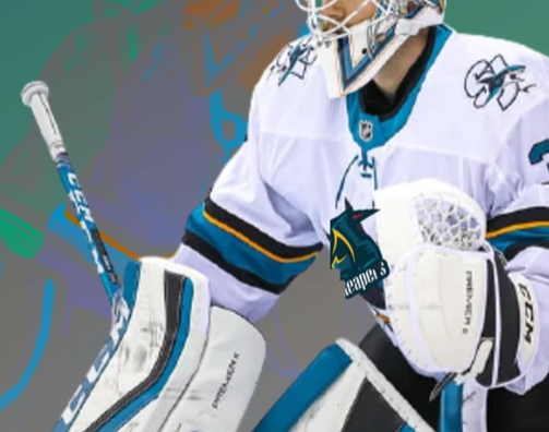
review: i have no idea how tf u can do a logo swap like that. the logo looks shifted just like the jersey is and the shadow's on the jersey go right on the logo as well. the new riga logo looks sick too. 10/10