Gustav 6,092 Posted August 16, 2021 Share Posted August 16, 2021 @TheCHEESE hope you like it! TheCHEESE, Ricer13 and Steve 3 Link to comment Share on other sites More sharing options...
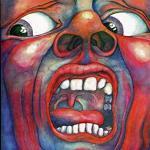
Thunfish 72 Posted August 16, 2021 Share Posted August 16, 2021 This is an absolute banger. I really like the effects used here, they give the image a sort of motion-esque aura to it and that really helps the player stand out or just generate hype, I guess? My only complaint would be the font for the team name, which is a little bit hard to read, given the size of the image and whatnot. I'd avoid this sort of handwritten font because it's usually harder to sort out than some normal Arial-esque stuff. Still, great stuff in spite of that little bit. 10/10 Gustav 1 Link to comment Share on other sites More sharing options...
Steve 1,713 Posted August 22, 2021 Share Posted August 22, 2021 Review: You have all the required elements to make an outstanding graphic. Render is large, which is more my style, the main text looks really good to my old eyes. The team text is a bit hard to read but not a big issue to me as the render and name are the focal point. Your color palette choice is very contrasting but in a good way. I would, in the past, not be a fan of this mixed bag of colors but you really make it work. Good stuff. 9/10 Gustav 1 Link to comment Share on other sites More sharing options...
.png.ed69a7260a477fcf4feead7a0e4b7506.png)
Recommended Posts
Create an account or sign in to comment
You need to be a member in order to leave a comment
Create an account
Sign up for a new account in our community. It's easy!
Register a new accountSign in
Already have an account? Sign in here.
Sign In Now