Gaikoku-hito 1,624 Posted August 16, 2021 Share Posted August 16, 2021 Link to comment Share on other sites More sharing options...
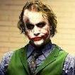
Steve 1,713 Posted August 29, 2021 Share Posted August 29, 2021 Review: This is a fun graphic to look at. I am not sure what stock you used for the background but that frozen person kinda throws me off. I like the text. You really did a nice job with the shadow effect on the text. Only wish it was not behind the render. The render looks okay but I think you could have work with it a bit more for some detail/ highlights or something. It just looks a little flat. The logos at the top could have been made part of the frozen theme. Really it sounds like I am picking it apart but I love the concept and your color palette of blue and gold never gets old. Great job. 8/10 Gaikoku-hito 1 Link to comment Share on other sites More sharing options...
thadthrasher 1,692 Posted August 31, 2021 Share Posted August 31, 2021 I really like this concept! To add to what @Steve was saying, maybe adding a bit of a blue tint to your render would help make it feel like he was a part of the graphic. If I did it, I would flip everything except the background. That way frozen dude in the back is looking at non-frozen dude in the front lol 8/10 Steve 1 Link to comment Share on other sites More sharing options...
.png.ed69a7260a477fcf4feead7a0e4b7506.png)
Recommended Posts
Create an account or sign in to comment
You need to be a member in order to leave a comment
Create an account
Sign up for a new account in our community. It's easy!
Register a new accountSign in
Already have an account? Sign in here.
Sign In Now