Girts 759 Posted January 12, 2022 Share Posted January 12, 2022 MubbleFubbles 1 Link to comment Share on other sites More sharing options...
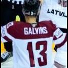
rory 1,759 Posted January 13, 2022 Share Posted January 13, 2022 REVIEW: You have a very good grasp of the basics of graphics and seem well on the way to becoming a sig god! Text is a major issue for a lot of sig creators and that really comes with downloading fonts that work and integrating them into the graphic so they don't stick out, you'll get an eye for it. The logo swap is alright, but I like to use a light wave filter on photoshop so that it creates a bubble effect and takes on more of 3D feel. I like that you didn't take the render outside of a hockey arena. My personal opinion is that hockey players should stay in the arena and not be out willy nilly on a space background 7/10, good work Girts 1 Link to comment Share on other sites More sharing options...
.png.ed69a7260a477fcf4feead7a0e4b7506.png)
Recommended Posts
Create an account or sign in to comment
You need to be a member in order to leave a comment
Create an account
Sign up for a new account in our community. It's easy!
Register a new accountSign in
Already have an account? Sign in here.
Sign In Now