Girts 759 Posted March 22, 2022 Share Posted March 22, 2022 Shindigs, dlamb and Scurvy 1 2 Link to comment Share on other sites More sharing options...
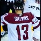
SlapshotWrangler 781 Posted March 28, 2022 Share Posted March 28, 2022 Review: Another really solid graphic! I've always found Warsaw's colours hard to work with so I have a lot of respect for you for finding renders that somewhat fit with the Warsaw Predators colours. Font is serviceable, though I found it quite plain. However, better to play it safe than sorry. Logo swap is convincing, though I think the logo is a rotated a bit too much. The sparks filter/effect in front of the render is pretty cool. I noticed those in your Aces graphic and I'm glad they made a return. The photo is a bit too bright and saturated for my liking. Solid graphic, overall, looks decent, maybe you could do more to make it more Galvins and less Puljijarvi. 6.5/10 Link to comment Share on other sites More sharing options...
.png.ed69a7260a477fcf4feead7a0e4b7506.png)
Recommended Posts
Create an account or sign in to comment
You need to be a member in order to leave a comment
Create an account
Sign up for a new account in our community. It's easy!
Register a new accountSign in
Already have an account? Sign in here.
Sign In Now