Jbeezy76 396 Posted August 19, 2019 Share Posted August 19, 2019 Link to comment Share on other sites More sharing options...
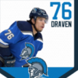
Zeno 42 Posted August 20, 2019 Share Posted August 20, 2019 Review: Nice job! Everything about this card looks really professional. The removal of the Blue Jackets logo is really good, but I would have liked to see a USA logo on the jersey. It is also a little hard to see the players name. Overall though, I really like how you did this card. Jbeezy76 1 Link to comment Share on other sites More sharing options...
Jbeezy76 396 Posted August 20, 2019 Author Share Posted August 20, 2019 26 minutes ago, Zeno said: Review: Nice job! Everything about this card looks really professional. The removal of the Blue Jackets logo is really good, but I would have liked to see a USA logo on the jersey. It is also a little hard to see the players name. Overall though, I really like how you did this card. Yeah the original looks more clear. Seems like ever time I try to upload the original it’s way to big of a file. Then I resize it so much it messed up the entire quality and blurred it too. Link to comment Share on other sites More sharing options...
Zeno 42 Posted August 20, 2019 Share Posted August 20, 2019 1 minute ago, Jbeezy76 said: Yeah the original looks more clear. Seems like ever time I try to upload the original it’s way to big of a file. Then I resize it so much it messed up the entire quality and blurred it too. It happens! I still really like the whole format of it though. Jbeezy76 1 Link to comment Share on other sites More sharing options...
.png.ed69a7260a477fcf4feead7a0e4b7506.png)
Recommended Posts
Create an account or sign in to comment
You need to be a member in order to leave a comment
Create an account
Sign up for a new account in our community. It's easy!
Register a new accountSign in
Already have an account? Sign in here.
Sign In Now