Patrik Tallinder 1,079 Posted February 22, 2021 Share Posted February 22, 2021 enigmatic 1 Link to comment Share on other sites More sharing options...
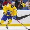
GreenGato 101 Posted March 1, 2021 Share Posted March 1, 2021 Review: All of the professional marks of a seasoned VHL signature maker are here. The player cutout is crisp and the logo swap is clean. The font is so funky and the style works with the triangles in the background. I like the simplicity of the design and the glow effect pops all around. The angle of the triangles does interact with the font oddly in the first "R", "M", and "V". I wonder if the lines of triangles were more in line with the lines of letters if that would look better or if they more offset if that would look better. I would also do something with the background, perhaps a darker one to make the rest of it shine even more. 9.25/10 Patrik Tallinder 1 Link to comment Share on other sites More sharing options...
.png.ed69a7260a477fcf4feead7a0e4b7506.png)
Recommended Posts
Create an account or sign in to comment
You need to be a member in order to leave a comment
Create an account
Sign up for a new account in our community. It's easy!
Register a new accountSign in
Already have an account? Sign in here.
Sign In Now