Girts 1,219 Posted February 12, 2022 Share Posted February 12, 2022 Shindigs 1 Link to comment https://vhlforum.com/topic/116332-galvins-card/ Share on other sites More sharing options...
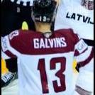
SlapshotLegion 870 Posted February 21, 2022 Share Posted February 21, 2022 Review: Sometimes it's best to keep the graphic simple and clean! It's refreshing to see a stat graphic that does not try to do too much with the player while also not being text on a plain background. Player render choice is nice and the logo swap is serviceable enough to look pretty solid. Love the slight blue tone on the bottom of the text and the font selection is pretty solid. Having a black border is a very nice choice to make it look contained. I'm also glad you chose some fairly good spots to put the text without needing a shadow or background. The way it's placed does not block anything of interest and looks very organized. In terms of feedback, I wish there was more done with the player and at the very least maybe more interesting text for the player name in order to make in stand out. Other than that, it's pretty solid. 7/10 Link to comment https://vhlforum.com/topic/116332-galvins-card/#findComment-911263 Share on other sites More sharing options...
.png.ed69a7260a477fcf4feead7a0e4b7506.png)
Recommended Posts
Create an account or sign in to comment
You need to be a member in order to leave a comment
Create an account
Sign up for a new account in our community. It's easy!
Register a new accountSign in
Already have an account? Sign in here.
Sign In Now