Hendrix Cobberson 31 Posted June 6, 2022 Share Posted June 6, 2022 Link to comment https://vhlforum.com/topic/121915-lorenzo-cobberson/ Share on other sites More sharing options...
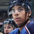
Steve 2,018 Posted June 19, 2022 Share Posted June 19, 2022 Review: This is a large graphic that needs a large render. The most common size would have the players helmet clip the top boarder and cutoff at or just below the waist, yes, a huge render. If you made your render pop like the text it would have really helped the lack of detail and the low brightness. This is not bad. A good design concept that needs to go a bit further. Clean off any NHL branding. Good effort, you will only get better. 8/10 Link to comment https://vhlforum.com/topic/121915-lorenzo-cobberson/#findComment-932127 Share on other sites More sharing options...
.png.ed69a7260a477fcf4feead7a0e4b7506.png)
Recommended Posts
Create an account or sign in to comment
You need to be a member in order to leave a comment
Create an account
Sign up for a new account in our community. It's easy!
Register a new accountSign in
Already have an account? Sign in here.
Sign In Now