Girts 1,205 Posted December 8, 2021 Share Posted December 8, 2021 MubbleFubbles, Spartan and AJW 2 1 Link to comment https://vhlforum.com/topic/113117-galvins-new/ Share on other sites More sharing options...
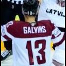
Spartan 4,725 Posted December 8, 2021 Share Posted December 8, 2021 @Girts I rarely comment on graphics posts, but considering I denied your first one for not meeting graphics standards and you responded with this, I'll say you did very well! Added some effects to it, cropped it well, text is also pretty cool though I'm not sure if the light blue fits the rest of the sig going on here. The little spiral effects going on are interesting, but it suitably blurs out the background to get all the focus on the player. Soon you'll be cutting renders, doing logo swaps and so much more like a pro. Great response after getting your other graphic denied! V proud . Girts 1 Link to comment https://vhlforum.com/topic/113117-galvins-new/#findComment-893090 Share on other sites More sharing options...
Ben 200 Posted December 8, 2021 Share Posted December 8, 2021 Overall considering it seems to be one of your first times it’s not that bad. Personally I’m not that good at graphics so anything else Simone does will look better then mine. It’s simple which is better then adding 20 different random effect and hoping it turns out. It’s pretty solid but nothing crazy so I’ll give it 6.5/10. Girts 1 Link to comment https://vhlforum.com/topic/113117-galvins-new/#findComment-893102 Share on other sites More sharing options...
.png.ed69a7260a477fcf4feead7a0e4b7506.png)
Recommended Posts
Create an account or sign in to comment
You need to be a member in order to leave a comment
Create an account
Sign up for a new account in our community. It's easy!
Register a new accountSign in
Already have an account? Sign in here.
Sign In Now