Girts 1,194 Posted May 5, 2022 Share Posted May 5, 2022 JardyB10 and Scurvy 2 Link to comment https://vhlforum.com/topic/120658-galvins/ Share on other sites More sharing options...
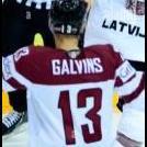
Steve 2,019 Posted May 29, 2022 Share Posted May 29, 2022 Review: Not a bad looking graphic. I am not sure you do any render cutting. It looks like a stock photo with some effects added though I could be wrong. I like the detail in the face. Logo swap looks good. NHL branding show be removed. Funny swirl effects you put in this. Text looks good where it's at. Not bad. 8/10 Link to comment https://vhlforum.com/topic/120658-galvins/#findComment-928743 Share on other sites More sharing options...
ke1vi 665 Posted May 30, 2022 Share Posted May 30, 2022 Review Pretty good graphic Girtz. I like the blue lighting in the corners as it gives the graphic a bit of balance. The jersey swap is pretty much perfect and I do love the swirls right on the face of the Canucks player lol. Gives it a nice bit of detail. I think you should focus on adding more lighting to the render to bring it out a little bit. Just like a white softlight. Nice to see some improvement! 8/10 Link to comment https://vhlforum.com/topic/120658-galvins/#findComment-928837 Share on other sites More sharing options...
.png.ed69a7260a477fcf4feead7a0e4b7506.png)
Recommended Posts
Create an account or sign in to comment
You need to be a member in order to leave a comment
Create an account
Sign up for a new account in our community. It's easy!
Register a new accountSign in
Already have an account? Sign in here.
Sign In Now