fever95 333 Posted April 19, 2020 Share Posted April 19, 2020 @FrostBeard FrostBeard 1 Link to comment https://vhlforum.com/topic/81042-frostbeard/ Share on other sites More sharing options...
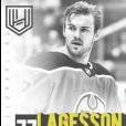
Guest Posted April 20, 2020 Share Posted April 20, 2020 I really like the snowflakes, they look nice and are fitting for Frostbeard. The font is cool as well. The white font/snowflakes and the blue background contrast nicely. The only thing I don't like is the double vision effect with the player. Overall I give it a 8.5/10, nice graphic my guy. Link to comment https://vhlforum.com/topic/81042-frostbeard/#findComment-734666 Share on other sites More sharing options...
Steve 2,092 Posted May 17, 2020 Share Posted May 17, 2020 Review: I really like this design. The double exposure effect can be tricky to pull off but this time it seems to work well. Colors work really well with the other elements and I like your text, though a touch larger or longer might look better, or not. Great overall look. Great work. 8/10 Link to comment https://vhlforum.com/topic/81042-frostbeard/#findComment-743411 Share on other sites More sharing options...
.png.ed69a7260a477fcf4feead7a0e4b7506.png)
Recommended Posts
Create an account or sign in to comment
You need to be a member in order to leave a comment
Create an account
Sign up for a new account in our community. It's easy!
Register a new accountSign in
Already have an account? Sign in here.
Sign In Now