Girts 1,219 Posted November 13, 2021 Share Posted November 13, 2021 (edited) Edited November 13, 2021 by Girts Ledge, rory, v.2 and 3 others 5 1 Link to comment https://vhlforum.com/topic/111229-girts-galvins/ Share on other sites More sharing options...
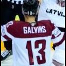
Hogan 1,437 Posted November 21, 2021 Share Posted November 21, 2021 Review: I was going to start this by saying its a pretty nice graphic for a new player, then I checked when you joined. Welcome back! Despite being a pretty basic graphic I still enjoy it and it's better than most first graphics. The text and effect give it a nice vintage look to it. From here on, you should keep improving on skills that already seem to be there and you'll be making great graphics in no time. 7/10 Girts 1 Link to comment https://vhlforum.com/topic/111229-girts-galvins/#findComment-887289 Share on other sites More sharing options...
MrMonkey 58 Posted November 21, 2021 Share Posted November 21, 2021 Review: Really basic graphic but sometimes thats a good thing! I really like the colors and how they mesh together. If I am completely honest, I am actually wondering what you did to this image other than put your name on there. Anyways the image is really good. Interesting font choice for your name but it doesn't hurt the image in anyway. Overall I think this is a solid graphic but that seems to be about it, I do like it. 6.5/10 Girts 1 Link to comment https://vhlforum.com/topic/111229-girts-galvins/#findComment-887606 Share on other sites More sharing options...
Vat 234 Posted November 21, 2021 Share Posted November 21, 2021 Review: I like what you're going for. Although I would e cut out the player and put him in a different background, idk if it's just personal preference but I would like to see it with a background that doesn't look to realistic, if you could've done that I would've like the sig more. That doesn't mean it's bad! I like the style your going for and I really dig the text, it matches with the jersey and it's not too "crazy" like some others can be. Overall well done! 7/10 Girts 1 Link to comment https://vhlforum.com/topic/111229-girts-galvins/#findComment-887889 Share on other sites More sharing options...
.png.ed69a7260a477fcf4feead7a0e4b7506.png)
Recommended Posts
Create an account or sign in to comment
You need to be a member in order to leave a comment
Create an account
Sign up for a new account in our community. It's easy!
Register a new accountSign in
Already have an account? Sign in here.
Sign In Now