Girts 1,214 Posted March 29, 2022 Share Posted March 29, 2022 (edited) Edited March 29, 2022 by Girts Scurvy, dlamb and Shindigs 1 2 Link to comment https://vhlforum.com/topic/118257-galvins-warsaw/ Share on other sites More sharing options...
Scurvy 1,739 Posted March 29, 2022 Share Posted March 29, 2022 Damn, looks great! I need to learn graphics. Girts 1 Link to comment https://vhlforum.com/topic/118257-galvins-warsaw/#findComment-917648 Share on other sites More sharing options...
Girts 1,214 Posted March 31, 2022 Author Share Posted March 31, 2022 On 3/29/2022 at 1:45 PM, Scurvy said: Damn, looks great! I need to learn graphics. Thanks! I'll make you a Warsaw sig next week! Scurvy 1 Link to comment https://vhlforum.com/topic/118257-galvins-warsaw/#findComment-917867 Share on other sites More sharing options...
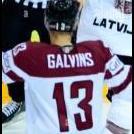
Plate 386 Posted April 2, 2022 Share Posted April 2, 2022 On the whole, this feels like a pretty safe signature. The logo swap is clean and matches well with the player considering Warsaw's colors have a hard time finding a home with existing teams. I think the filter over the image is a bit too strong and can be a little distracting. A big thing about images and signature making is light management. If you just darkened the edges of the signature a little bit, especially from the bottom of the image where the ice and boards are, it would bring more attention to the skater. I would also recommend going outside your comfort zone and experimenting with different font styles. The G on this style, in particular, is very busy and sort of pulls away from the image, fighting for attention. Otherwise, a very standard signature with some improvements to work on. 5.5/10 Girts 1 Link to comment https://vhlforum.com/topic/118257-galvins-warsaw/#findComment-918205 Share on other sites More sharing options...
.png.ed69a7260a477fcf4feead7a0e4b7506.png)
Recommended Posts
Create an account or sign in to comment
You need to be a member in order to leave a comment
Create an account
Sign up for a new account in our community. It's easy!
Register a new accountSign in
Already have an account? Sign in here.
Sign In Now