Girts 849 Posted April 15, 2022 Share Posted April 15, 2022 dlamb 1 Link to comment Share on other sites More sharing options...
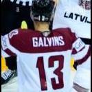
Kendrick 4,733 Posted April 16, 2022 Share Posted April 16, 2022 Review: I do love the coordination of the colours with the jersey change. I would say next step is putting some time into the text work. Try experimenting with different fonts, playing with the effects and try doing backing text to your top layered text. One thing I can tell is you have a good grasp of the effects on layers and your lighting seems to be pretty good. You are well on your way to creating a lot of quality graphics! Girts 1 Link to comment Share on other sites More sharing options...
thadthrasher 1,692 Posted April 16, 2022 Share Posted April 16, 2022 I think my absolute favorite thing about this graphic is not the lights, not the colors, not even the render itself, but actually the little swirls that are up around the head of the player and in the crowd. It's a neat little addition, and I enjoy it. This is a clean graphic all around. The lighting is nice and well done, the flares add some uniqueness to this. The two things I would work on are the font and the logo swap. The logo swap isn't too bad, just needs to be tilted down and in a bit more, and the font isn't terrible but I think there is a better one for this. Overall, 8/10! Girts 1 Link to comment Share on other sites More sharing options...
.png.ed69a7260a477fcf4feead7a0e4b7506.png)
Recommended Posts
Create an account or sign in to comment
You need to be a member in order to leave a comment
Create an account
Sign up for a new account in our community. It's easy!
Register a new accountSign in
Already have an account? Sign in here.
Sign In Now