Girts 1,216 Posted May 12, 2022 Share Posted May 12, 2022 Scurvy 1 Link to comment https://vhlforum.com/topic/120851-girts/ Share on other sites More sharing options...
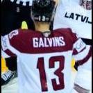
Kendrick 4,741 Posted May 15, 2022 Share Posted May 15, 2022 (edited) Review: The hardest thing to do in graphics is make Puljarvvi not look like a complete handicap. He looks good here and I love the layering techniques and the stocks you used. Next step is working on your text work as it does look good here but maybe making it so that the surname is a different size and stands out some more. Colour scheme is great and the lighting could be a bit mixed in as it does appear that the top half of the sig just has a bunch of random lights. 8/10 Edited May 16, 2022 by Kendrick Girts 1 Link to comment https://vhlforum.com/topic/120851-girts/#findComment-926369 Share on other sites More sharing options...
Daniel Janser 2,322 Posted May 15, 2022 Share Posted May 15, 2022 13 hours ago, Kendrick said: Review: The hardest thing to do in graphics is make Puljarvvi not look like a complete handicap. He looks good here and I love the layering techniques and the stocks you used. Next step is working on your text work as it does look good here but maybe making it so that the surname is a different size and stands out some more. Colour scheme is great and the lighting could be a bit mixed in as it does appear that the top half of the sig just has a bunch of random lights. you forgot the rating Kendrick, which I am being told is essential should you wish to claim the review for TPE... Link to comment https://vhlforum.com/topic/120851-girts/#findComment-926424 Share on other sites More sharing options...
Kendrick 4,741 Posted May 16, 2022 Share Posted May 16, 2022 12 hours ago, Daniel Janser said: you forgot the rating Kendrick, which I am being told is essential should you wish to claim the review for TPE... Weird, I didn't think the rating resulted in any change in what you claim? Link to comment https://vhlforum.com/topic/120851-girts/#findComment-926504 Share on other sites More sharing options...
ke1vi 665 Posted May 16, 2022 Share Posted May 16, 2022 I do wish Girts was in the Riga system with that Latvian background but either way you did a good job on the sig. I love the Warsaw jersey swap on the Oilers jersey. You have a overlay stock that looks like its pixelated, so i'd recommend using a high quality picture when trying to overlay it on your graphic (really use high quality for everything). The stock also needs some adjustment so its blending in with the sig more than sitting on top of it. It does add a cool "snowy" effect though. The text is pretty straight forward here - I would have made it bigger and move it to the bottom to balance the sig more. Still a good job. 7.5/10 Girts 1 Link to comment https://vhlforum.com/topic/120851-girts/#findComment-926523 Share on other sites More sharing options...
Gaikoku-hito 2,324 Posted May 16, 2022 Share Posted May 16, 2022 Review: I am not sure but something is putting me off with this graphic when I look at it. Maybe it is due to all the flare at the top of the graphic and less at the bottom creating an uneasy unbalanced feeling to the graphic or it is just the players looks goofy making a weird face. Either way I am going to go with unbalanced nature so try to keep the top and bottom the same. While I am nick-picking the graphic I also notice the other players logo is circle and doesn`t look like the wolves head which is a bit off putting once you see it. Everything else looks clean and a well done graphic with a ton of effort. Overall: 9/10 Girts 1 Link to comment https://vhlforum.com/topic/120851-girts/#findComment-926555 Share on other sites More sharing options...
Eynhallow 412 Posted May 16, 2022 Share Posted May 16, 2022 I quite like this graphic. I like the slightly faded look to the whole piece and the speckles that are prevalent throughout give the whole thing a sort of old timey feel. Very nice logo swap. Your choice of font is excellent. It is large enough to be easily read. I also would like to commend you on how you have outlined the text and provided a bit of background to it using the colours that are on your player's uniform. I also like your choice of render. That is a player who is enjoying playing the game ! Nice work. 8.5/10 Link to comment https://vhlforum.com/topic/120851-girts/#findComment-926607 Share on other sites More sharing options...
.png.ed69a7260a477fcf4feead7a0e4b7506.png)
Recommended Posts
Create an account or sign in to comment
You need to be a member in order to leave a comment
Create an account
Sign up for a new account in our community. It's easy!
Register a new accountSign in
Already have an account? Sign in here.
Sign In Now