Jala 922 Posted January 12, 2015 Share Posted January 12, 2015 Link to comment Share on other sites More sharing options...
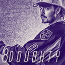
iRockstar 307 Posted January 12, 2015 Share Posted January 12, 2015 Effort: 2/2 - I can see the effort put in, all the essentials and then some. Look: 2.75/3 - This is a huge step up I'd say, so I'm rewarding you for it, to encourage that you continue to improve. Really good blending, I like the right side beside the render, looks really nice. Text could be better but for the graphic it works and fits in, certainly doesn't take away that's for sure. Creativity: 1/1 - Yep Total: 5.75/6 Link to comment Share on other sites More sharing options...
jack 498 Posted January 17, 2015 Share Posted January 17, 2015 Effort: 2/2 - Absolutely! Keep at it. Look: 2.5/3 - Great improvement, but there are still areas that I can give you some advice in. Try not to have the render so bright, you lose a lot of the detail in the image when it's blown out like that. Good stock work. As enigma said, the text needs some work. Lowering the opacity is a tough effect to get right. Try looking around the boards at sigs you like, and try your best to emulate the text they use. Creativity: 1/1 - Yessir. Total: 5.5/6 Final: 6/6 Link to comment Share on other sites More sharing options...
Frank 5,087 Posted January 24, 2015 Share Posted January 24, 2015 Claimed Link to comment Share on other sites More sharing options...
.png.ed69a7260a477fcf4feead7a0e4b7506.png)
Recommended Posts