701 309 Posted January 14, 2015 Share Posted January 14, 2015 Link to comment Share on other sites More sharing options...
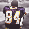
jack 498 Posted January 17, 2015 Share Posted January 17, 2015 Effort: 2/2 - Lighting, stock work, text work etc. Sick work. Look: 3/3 - Really nice. Only thing I may have changed would be cropping it a bit. I think it would look better a bit shorter at the top, clipping the helmet a little bit. Also, not a huge fan of the Soft Light 1px border. Great work though. Creativity: 1/1 - Great colouring. Total: 6/6 Link to comment Share on other sites More sharing options...
iRockstar 307 Posted January 18, 2015 Share Posted January 18, 2015 effort: 2/2 - yeah this is great look: 3/3 - I feel like the old sig with this text fit, but because Richardson is such a big last name, it makes it look a little odd. Overall though that's my only complaint. I really like this one creativity: 1/1 - yessss total: 6/6 final: 6 Link to comment Share on other sites More sharing options...
Frank 5,087 Posted January 24, 2015 Share Posted January 24, 2015 Claimed Link to comment Share on other sites More sharing options...
.png.ed69a7260a477fcf4feead7a0e4b7506.png)
Recommended Posts