qripll 433 Posted July 28, 2021 Share Posted July 28, 2021 dlamb and lil OG z 2 Link to comment Share on other sites More sharing options...
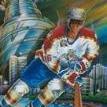
bigAL 2,176 Posted July 29, 2021 Share Posted July 29, 2021 Review: nicely done! The filters help make the colours look a bit more natural than just painting the red jerseys orange. Towes' logo swap is great, but Kane's needs some adjustment. The two logos are level, but their bodies aren't. Rotating Kane's a few degrees clockwise would make it look more physically proper. Overall, nicely done! 8/10 Link to comment Share on other sites More sharing options...
.png.ed69a7260a477fcf4feead7a0e4b7506.png)
Recommended Posts
Create an account or sign in to comment
You need to be a member in order to leave a comment
Create an account
Sign up for a new account in our community. It's easy!
Register a new accountSign in
Already have an account? Sign in here.
Sign In Now