Caillean 504 Posted November 15, 2014 Share Posted November 15, 2014 gorlab 1 Link to comment Share on other sites More sharing options...
Jamie 438 Posted November 15, 2014 Share Posted November 15, 2014 You're a nerd Link to comment Share on other sites More sharing options...
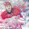
BOOM 8,571 Posted November 15, 2014 Share Posted November 15, 2014 Heavy on the eyeliner. Link to comment Share on other sites More sharing options...
Caillean 504 Posted November 15, 2014 Author Share Posted November 15, 2014 You're a nerd Aren't we all, though. Link to comment Share on other sites More sharing options...
Caillean 504 Posted November 15, 2014 Author Share Posted November 15, 2014 Heavy on the eyeliner. Eyeliner where it's at, boss. Link to comment Share on other sites More sharing options...
Mr. Grumpy Bear 347 Posted November 16, 2014 Share Posted November 16, 2014 Effort: 2/2 - Blending, text, coloring, you have it but try adding some lighting next time, it'll really pull things together for you.. Look: 2.5/3 - Text could be better and the placement should be a little more towards the render imo. Overall you did a good job of the blending but the lack of lighting hurt you. love the addition of a logo. Keep at it, I see improvements in you young padawan Creativity: 1/1 - Yeah Total: 5.5/6 Link to comment Share on other sites More sharing options...
701 309 Posted November 17, 2014 Share Posted November 17, 2014 Effort: 2/2 - You got it. Look: 2.75/3 - Text is my only major complaint here, I think if you chose something better for the font, this would be miles better. I like that you used a lady render, and I like the jersey change. Creativity: 1/1 - Yep. Total: 5.75/6 FINAL 6 Link to comment Share on other sites More sharing options...
Kendrick 4,736 Posted November 23, 2014 Share Posted November 23, 2014 Claimed Link to comment Share on other sites More sharing options...
.png.ed69a7260a477fcf4feead7a0e4b7506.png)
Recommended Posts