Jala 922 Posted December 22, 2014 Share Posted December 22, 2014 gorlab 1 Link to comment Share on other sites More sharing options...
Kendrick 4,725 Posted December 22, 2014 Share Posted December 22, 2014 That's right folks. I am a smurf now! Link to comment Share on other sites More sharing options...
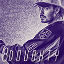
Mr. Grumpy Bear 347 Posted December 23, 2014 Share Posted December 23, 2014 Effort: 2/2 - Blending, text, coloring, lighting, Stock work, effects, you definitely have it. Look: 2/3 - It's washed out from the effects and some of the blending effects don't really match that well. I feel like a lot was done here but not much flows well together in my opinion. The render needs to be brought and made the focal point. Basically just work on those finishing touches. Creativity: 1/1 - Yeah Total: 5/6 Link to comment Share on other sites More sharing options...
solas 1,946 Posted December 30, 2014 Share Posted December 30, 2014 Effort: 2/2 - You clearly put in effort here. Look: 2.25/3 - There are a couple good starting points but all in all the ideas you have here don't really work well together. I like the displacing/smudging effects (or whatever you did to get those render effects), and I think you could kind of build around that with stock work and lighting - maybe make the background a bit darker and make the lighting a bit more contrasted on the render (i.e. adjust the curves). The lighting on the render as it is now (looks like a lens flare) makes it looked too washed out. I'd generally avoid lens flares as well, as it's very hard to do them well. Creativity: 1/1 Total: 5.25/6 FINAL GRADE: 5/6 Link to comment Share on other sites More sharing options...
.png.ed69a7260a477fcf4feead7a0e4b7506.png)
Recommended Posts