Jala 922 Posted February 26, 2016 Share Posted February 26, 2016 gorlab 1 Link to comment Share on other sites More sharing options...
eaglesfan036 4,596 Posted February 26, 2016 Share Posted February 26, 2016 no me Link to comment Share on other sites More sharing options...
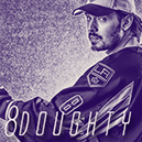
Commissioner Beketov 8,961 Posted February 29, 2016 Commissioner Share Posted February 29, 2016 I'd like to see a bit more colour going on. This sepia tone thing looks a little awkward for my liking. Lighting is okay but move it over to the left a tad so a bit more of the renee is in shadow; that'll create a better contrast. The out of focus text works pretty well but put it over the render a bit more to enhance the depth. Little sparkly bits work pretty well here, gives it a dreamlike feel. Link to comment Share on other sites More sharing options...
Jala 922 Posted February 29, 2016 Author Share Posted February 29, 2016 Very helpful criticism, I can see what you mean. That was sort of what I was going for with the sparkles, a surreal feel. Thanks! Link to comment Share on other sites More sharing options...
jack 498 Posted March 1, 2016 Share Posted March 1, 2016 Agree with everything Beketov said. Another thing I'd add would be to maybe decrease the spacing between letter on the 'doughty'. As of now it seems a bit too articulated. Good render placement. With the colouring, I think if you wanted to keep the sepia, I'd add some splashes of blue. Take a soft round brush on 70-100 opacity, and set the colour to a medium blue. Click in a few places, then set the layer to Color Dodge. Adjust the opacity of the layer and erase anything that doesn't really work. Could really add a bit of a dynamic to the sig. Link to comment Share on other sites More sharing options...
Jala 922 Posted March 1, 2016 Author Share Posted March 1, 2016 Never would've thought of that, thanks Jackim. jack 1 Link to comment Share on other sites More sharing options...
Tim 182 Posted March 11, 2016 Share Posted March 11, 2016 Claimed Link to comment Share on other sites More sharing options...
.png.ed69a7260a477fcf4feead7a0e4b7506.png)
Recommended Posts
Create an account or sign in to comment
You need to be a member in order to leave a comment
Create an account
Sign up for a new account in our community. It's easy!
Register a new accountSign in
Already have an account? Sign in here.
Sign In Now