Jbeezy76 396 Posted October 14, 2019 Share Posted October 14, 2019 Link to comment https://vhlforum.com/topic/71003-draven-new-graphic-22/ Share on other sites More sharing options...
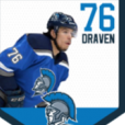
ThePerfectNut 563 Posted October 14, 2019 Share Posted October 14, 2019 Review: I love when people tries to swap logo because I know how hard it is to do it and it was done cleanlyyyy. I love the black around the image because it add somewhat of an effect to your image, but your C seems a little bit off on your jersey for me. It's too black if you know what I mean. At the end of the day, it's a really nicely image that you have done yougin. Jbeezy76 1 Link to comment https://vhlforum.com/topic/71003-draven-new-graphic-22/#findComment-676793 Share on other sites More sharing options...
Steve 2,072 Posted November 17, 2019 Share Posted November 17, 2019 Review: Nice overall graphic with some interesting elements. I like the player and text placement for the most part and your choice of font is fun to look at. I really like the side effects and maybe left off the bottom dabs. Very good effort. Link to comment https://vhlforum.com/topic/71003-draven-new-graphic-22/#findComment-687052 Share on other sites More sharing options...
.png.ed69a7260a477fcf4feead7a0e4b7506.png)
Recommended Posts
Create an account or sign in to comment
You need to be a member in order to leave a comment
Create an account
Sign up for a new account in our community. It's easy!
Register a new accountSign in
Already have an account? Sign in here.
Sign In Now