Jbeezy76 396 Posted October 7, 2019 Share Posted October 7, 2019 Link to comment Share on other sites More sharing options...
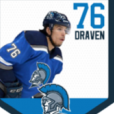
DoktorFunk 810 Posted November 22, 2019 Share Posted November 22, 2019 Review Couple of things I love about this. The McDonald's sponsorship is hilarious and the logo looks really natural. I think the name could be a different color to make it stand out more and the font I just don't feel fits the picture, but overall, solid. Link to comment Share on other sites More sharing options...
.png.ed69a7260a477fcf4feead7a0e4b7506.png)
Recommended Posts
Create an account or sign in to comment
You need to be a member in order to leave a comment
Create an account
Sign up for a new account in our community. It's easy!
Register a new accountSign in
Already have an account? Sign in here.
Sign In Now