Jbeezy76 396 Posted September 16, 2019 Share Posted September 16, 2019 Tbeez99 1 Link to comment Share on other sites More sharing options...
DoktorFunk 810 Posted September 19, 2019 Share Posted September 19, 2019 (edited) Review I like seeing sigs and stuff for the new teams, and I like the lens flare, actually. Little rough looking, and I'm not sure if the Jersey color is the best choice, but a cool design and concept. Edited September 19, 2019 by DoktorFunk Jbeezy76 1 Link to comment Share on other sites More sharing options...
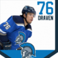
Kekzkrieg 160 Posted September 21, 2019 Share Posted September 21, 2019 Review: Awesome work on the shading and addition of the new logo, especially the customized "C" that makes it look more authentic. I really like the choice in font color and style. In my personal preference, I would have put the text down below instead of reading on his helmet but no biggie. Solid work overall and looking forward to our future work! Link to comment Share on other sites More sharing options...
.png.ed69a7260a477fcf4feead7a0e4b7506.png)
Recommended Posts
Create an account or sign in to comment
You need to be a member in order to leave a comment
Create an account
Sign up for a new account in our community. It's easy!
Register a new accountSign in
Already have an account? Sign in here.
Sign In Now