.png.ed69a7260a477fcf4feead7a0e4b7506.png)

.jpg.f060096fcf2042d9bcef3c15afe3ccac.jpg)
WithARevelYell
-
Posts
14 -
Joined
-
Last visited
About WithARevelYell

-
 KaleebtheMighty reacted to a post in a topic:
Thank you Igor Molotov!
KaleebtheMighty reacted to a post in a topic:
Thank you Igor Molotov!
-
v.2 reacted to a post in a topic:
LANDON THE CHAMP
-
Review: OK, first off stop it..that text is amazing (to me). I have so much trouble with it, but when I see just a classy looking text it inspires me to get better. The blur effect on the background just makes the render/player stand out. You just have to focus on the plaster and then the text. The render/player you also chosen really stands out. I like the positioning. I also like that the player & text take up a lot of space within the image. Red, white and blue is a great combo so this just pops.. amazing work. I then noticed the top and bottom has kinda' an opaque border, or a glow. A+ work Grade: 10/10
-
.thumb.jpg.00266a638b5be58b268f4bd20c633969.jpg)
Thank you Igor Molotov!
WithARevelYell replied to KaleebtheMighty's topic in Archived Graphics/Videos
Review: Three player images??? wow. The first thing that catches my eye is the color of the helmet, it just draws your attention. Then I have to take a closer look at the the other images.. both have the crest updated which is always nice. The text and background are just simple, yet classy and really pop. The only thing is maybe just add a hint of color to the other images & not make them all in grey. Maybe jersey of the second player & gloves of the other. Other than that its great. Grade: 10/10 -
Nice job guys
-
 ryf87 reacted to a post in a topic:
Dalton Canders III
ryf87 reacted to a post in a topic:
Dalton Canders III
-
 kirbithan reacted to a post in a topic:
Insert Elmo Fire Gif Here
kirbithan reacted to a post in a topic:
Insert Elmo Fire Gif Here
-
Graphic Review: Usually you don't get too many large graphics, but this one is Hugeeee!! Which is not a bad thing. I like the positioning of the render/player a side profile is pretty cool, and I see that you removed the NHL logo on collar. I would have maybe tried to blend the player into the background more, maybe even use a stroke or something so it is blended and doesn't look so flat. Also the helmet you could remove the Prudential and added the team logo, just to add a little more of the VHL in there. Not sure if you used a filter, but the grainy look is nice and the logo to the right maybe sublimate or add the name text on top of that. Overall really cool & I like it. Grade: 8.5/10
-
Graphic Review The first thing that stands out are the colors.. red, white and blue. Maybe they seem basic, but this combo is just so clean and classic. Changing the jersey up with the team logo looks nice, and it really is the focus of the whole piece to me. The Elmo graphic in the background with the clipping/smudge looks really cool as well, and I'm not sure if you added some texture in there or it came like that. The text is also really cool.. i like the gradient and then also using a different color makes it really stand out. If anything I would make have not clipped/cut the right arm, maybe leave that in and just clip more of the Elmo on there... other than that A+. Grade: 10/10
- 1 reply
-
- 1
-
-
Subject056 reacted to a post in a topic:
2nd Attempt
-
Trying to learn and get better.
- 1 reply
-
- 1
-
-
jacobcarson877 reacted to a post in a topic:
ADV
-
Review: Now this is what I need to learn... my Lord this is such a classic looking signature. Right away the background you see the flag, but the distortion just makes it "pop" even more. Then the render/player how it kinda' looks like it is part of the background... one image not just pasted right on top. It's not a bunch of layers just slopped together, but put together so nicely. Maybe a fed or blur technique Whatever it is its great. Then the text... using two different colors, with a shadow or gradient looks nice. then the smaller text within text with some player details.. amazing. I don't even know if I have a critique.. the lighting by the side of the face pops too... too much in this A+ Score: 10/10
-
Review: The first thing that stands out to me is the render/player. It's a good nice size and you get the full image of the helmet, jersey, socks... everything. The coloring of the gear is nice as well, seeing it all in the teams color. Also, the main crest is nice and clean you see it in all it's glory. For the background I like the smoky look, and I almost missed the 54 in the background when I was first looking at it. If I would give a critique I would have maybe added a 2nd render underneath and maybe made a blur, or something "blotchy" to make the main one stand out. Also maybe add a drop shadow or stroke to the text. Other than that I love it. the colors are just great. Score: 10/10
-
Subject056 reacted to a post in a topic:
1st Sig for the new guy
-
Subject056 reacted to a post in a topic:
Oreo
-
Review: I think just doing a black/white greyscale takes some guts, it is definitely not the easiest to do... and to make it look good as well. I think you did a really good job on this one. The image is really nice as it focuses on the player itself and kinda' almost fades the background for you so you focus on the player (main image). The VHL logo also stands and really grabs your eye as the centerpiece image for me. I would suggest next time to maybe try to remove the NHL logo and shoulder logos if you can, with a brush or blur maybe. The only real criticism would be the text/name. This is probably the hardest part when it comes to black/white images. I would try a blending glow/stroke or drop shadowing to just make the black part of the text standout against the background. Other that that it is a very clean classy looking graphic. 9/10
-
Review "my first so be gentle". I think the render that you have chosen is really good for a graphic. Lots of times, (myself included) you may only get the upper body or side image... not a whole body. Having the two teams is also a nice touch as the blue and red play off each other and gives the player a chance to standout with the background. The lighting is also nice on the shoulders and near the numbers and gloves. I also like you took the time to change the jersey crest and the colors match the uniform. Advice I would give would to maybe blend the render/player a bit more with the background.. maybe a blur in the background or fade. also the Season 87 maybe add a drop shadow to make it stand out a but more. Beside that sit is great... I love the text for the name (i need to work on those), but it is really good looking on this graphic. 8.5/10
-
Viper reacted to a post in a topic:
1st Sig for the new guy
-
Not the best, but still learning. Wanted to get something in before the end of the week. thanks
-
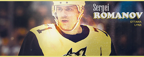
(S88) LW - Sergei Romanov, TPE: 78
WithARevelYell replied to WithARevelYell's topic in Create A Player
"more, more,more...." thanks. just checking everything out. -
WithARevelYell changed their profile photo
-
Hello, Thanks...new to the sim hockey league world. Looks like fun, not great at writing so might stick to graphics. Just on the player page trying to build my player & reading the guides.
- 1 reply
-
- 1
-
-
Player Information Username: WithARevelYell Player Name: Sergei Romanov Recruited From: Reddit Age: 19 Position: LW Height: 75 in. Weight: 220 lbs. Birthplace: Russia Player Page @VHLM GM
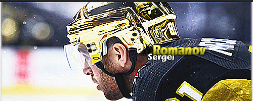
.thumb.jpg.00266a638b5be58b268f4bd20c633969.jpg)


