.png.ed69a7260a477fcf4feead7a0e4b7506.png)


Adrest245
-
Posts
378 -
Joined
-
Last visited
Content Type
Profiles
Forums
Events
Articles
Everything posted by Adrest245
-
Impressive graphic. But there’s a bit you can improve on. The render is pretty blurry, you can barely see his face. It’s not that well blended into the background. The text is nice, and I like the city background. Overall it’s a nice graphic but it could be Improved a bit, 7.5/10. Pass
-
Hi @Vkobe-v this is a pretty nice graphic. I like the way you have the goalie big, it really sticks out. And it’s the main part of the graphic which is well. The text is also pretty nice with the bright yellow. You could have maybe added a logo on the bottom right if I wanted to get picky. But I’m a fan of this graphic, pass. 9.5/10
- 1 reply
-
- 1
-

-
Your graphics in the sba, and efl have been great and it continues here, the render is crispy clean, the background is marvelous, text is fire. The whole graphic feel is just real nice, and I dig it. I love it. Keep up the amazing work man, your graphics are absolutely one of the bests I’ve seen 10/10
-
Hi @Vkobe-v nice little graphic here, the background with the trees is nice. There’s a little icy effect to it, and it looks nice, the font is something I haven’t seen. Maybe make the render a little visible and place it better? But no real problems with it. It’s pretty nice. 9/10
-
Moscow Menace Press Conference
Adrest245 replied to FacebookFighter's topic in Team Press Conferences
1. Because of @Eagle Eye 2. I didn’t pay attention but we should draft @Vkobe-v he’s a great guy 3. Up to you honestly, if you need one, then hire one 4. Working out and hitting the clubs 5. Babakar as he’s the most annoying on the team 6. I would make fun of Babakar -
-
Now this is an absolutely fire graphic. One of the best ones i've seen. Everything about it, is just perfect. The render is super clean. But I love the text and background. The tiny little details really make the graphic stand out. The ice effects on the text and background is amazing. The logo being pushed to the background is actually hard to do, and you made it look so easy. so amazing job. This is more than a 10/10.
-
This is a phenomenal graphic. The render is pretty clean. But what I like the most is the background. It looks really good. All the blending is well done. There could be a bit more lighting, but honestly, it looks really nice. The text is pretty cool. The color scheme is amazing, and overall this is a great graphic. So amazing work on it, and I can not wait to see more from you. 10/10 @Gaikoku-hito
- 1 reply
-
- 1
-

-
Moscow Menace Press Conference
Adrest245 replied to FacebookFighter's topic in Team Press Conferences
1. Good luck on your career. 2. It's on the up and up 3. Work together, and just play hard 4. Seems like a great guy, excited to see how he does 5. Any games would be talked about 6. I am glad, that I either play for you, or you play for me in all 3 Sim leagues, your a great guy -
_edited.jpeg.6c7e9bd3c2fdfddf774330338d6c8d60.jpeg)
-
@Lefty_S with another sick graphic. The render is very clean, and the background is absolutely amazing. The way all this is all blended is amazing. The Jersey number on the duk is the best. The ice is actually really nice, and I think this is an amazing graphic. I am a fan of this graphic and I think this is a 10/10. There is absolutely nothing wrong with the graphic. Amazing work Lefty. I can not wait to see more of your graphics. And as Kobe said above me, put this in a museum
-
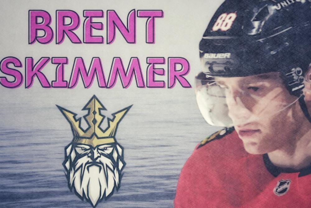
Really good stuff here. The render of your hockey player is really clean, and the background along with it is amazing. The render is well blended with the background. The text is very nice, it's giving me good vibes. I especially like the purple text, it looks real good with the purple background. This whole graphic is real neat, and I am a big fan of it. You could maybe limit the spaces which is blank on the right and left side on the render but other than that. Amazing work. This is a 9/10 for me
- 1 reply
-
- 1
-
-
Moscow Menace Press Conference
Adrest245 replied to FacebookFighter's topic in Team Press Conferences
1. He is doing better than Bahram Kamkar and that's all what matters to me 2. Anyone not named Bahram Kamkar 3. Bahram Kamkar JR 4. Any team which wants me 5. I do not know where to check this 6. More wood than Bahram Kamkar -
My day is good looking at this graphic. The render is well cut out and really well placed. the background is a good one. I think you picked a fire background, which works really well with the render The text is a bit hard to see but I think it's fine. Overall this a great graphic, it has a lot of good things. The blending is nice. And the frame was a good effect. This graphic is a 10/10. Keep up the amazing work!
-
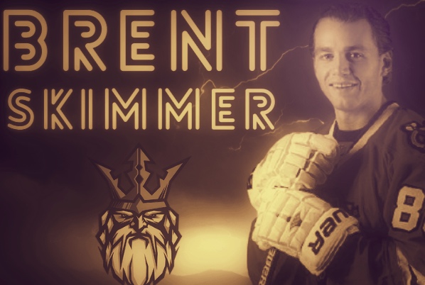
I like this graphic here. The dark brown effect gives it a nice vintage style to it. And the text is pretty nice. Maybe you could have added removed the background and have added a custom background. I use canva to add a custom background and I think my graphics are aight. But overall I love the vibes which this graphic is giving and I can not wait to see more from you. great Job! This is a 9/10.
-
Moscow Menace Press Conference
Adrest245 replied to FacebookFighter's topic in Team Press Conferences
1. we are gonna be great 2. Maybe PH 3. The Vodka 4. Being better than Bahram Kamkar 5. He helps me be better than Bahram Kamkar 6. Don't really watch NHL but Patrick Kane is my favorite -
-
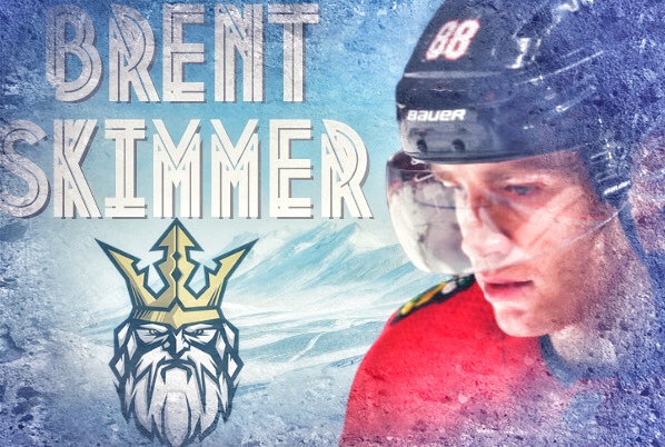
Fire graphic here. I love the mountians background which was used. The render could have been a bit bigger and so could the text. The text could also be a little visible but other than that, fire graphic and keep up the good work. 8/10
- 1 reply
-
- 1
-

-
Hi Lefty, this graphic is a pretty dope one. The render of your duck is well cutout, and the way the stick is in his hand looks nice. Further more, the Qak's on the back are a nice addition to the already sick background. Overall this is a nice graphic and I rate this a 9/10
-
Moscow Menace Press Conference
Adrest245 replied to FacebookFighter's topic in Team Press Conferences
1. Gl on your career 2. I am practicing hard so I can be better than Bahram Kamkar. 3. I am excited to beat Bahram Kamkar's ass 4. My mindset is the same. Be better than Bahram Kamkar 5. Anyone who is not named EagleEye 6. My personal goal is to be better than Bahram Kamkar and get called up before him -
_edited.jpeg.84fecc94cc12f4f3ee3b0f31642313af.jpeg)