RMiner57 23 Posted November 10, 2014 Share Posted November 10, 2014 So, people appreciated my last media spot to my great surprise, and when I said I would do another mark my words, I always come up on my word. So with not a lot of forethought and a healthy dose of stale milk, here's the sequel. Calgary Wranglers So before I review the emo horse, (look at that eye liner) let me note: This'll probaby suck. Sequels are always terrible, and I mean, look at the premise here. Awful. So here's the Calgary Wranglers. No one needs to wrangle this horse because by his expression there is clearly a case of diarrhea. Come on. You can just see the excretion there. And his eye... Gosh, the guy clearly ate too many peppers with those red eyes. What's with the dark outline? He's clearly got eyeliner. Grade: Get a bathroom, you horse. New York Americans Americas, eh? Not only did they have to go there with that patriotic title they had to put in the Captain America-esque shield. C'mon. It's so boring it just screams... Ugh. How can a team get excited wearing this logo to a game? Nobody. (just watch me get drafted by this team and take back everything I said in a style only rivalled by pros who really screw up on Twitter. "I was hacked.") Grade: So boring, that I couldn't come up with a good grade. Booo. Quebec City Meute From the Americans to the Quebecers. Or should I say, the mute. Because really. This wolf is howling, and clearly that's not mute. That's making noise. COME ON. And what's he doing coming out of a shield? Is he like, "this shield is so lame, I'm going to complain to the mods about it"? Who knows? Grade: Come on. This logo isn't making this review any easier. Seattle Bears So this bear looks really pissed. And, to top off the theme, ANOTHER SHIELD. It's a freaking trifecta. Or is it an oval? Either way, I've never seen a bear the colour of which that bear resembles. Is it some mutant bear that is really mad about being inside a lame shield/oval thing? That's probably the case. Maybe he wants to be separate from the crowd. Too bad, bear. Yer off the case. Grade: Who did this monstrosity kill to get a red fur coat? Scary. Toronto Legion So, let me cast off my anti-Toronto biases and handle this like a real pro. When could the logo of a legion look any less menacing? All this looks like is the logo of Aqua-Lovers Club of Blue Huggable Fun Times. Maybe the point here is to disrupt locker room pep talks for the opposing teams. I could just imagine the video coach coming in the midst of an inspirational speech from a head coach in front of his team, and as he looks back to point to the opposition's weaknesses he bursts into a giggling fit about how lame the logo looks and by the time the game starts the coach is pronounced dead, a turn of events fit only for the best of lethal weapons. Grade: Cleverly terrible. Maybe the Aqua-Lovers Club of Blue Huggable Fun Times should make a hockey club. So there you have it. The VHL and their logos, graded and summarized by an idiot. You can have the VHLM version of this media spot next week, so until then I bid you all a happy Monday. Note: I know Meute means something entirely different, just like the Express' wheels wouldn't appear in the logo. But that doesn't make for good cheap jokes. Wait, did I just say good cheap jokes? When is a cheap joke ever good? Advantage, Victor, Doomsday and 1 other 4 Link to comment Share on other sites More sharing options...
Frank 5,105 Posted November 10, 2014 Share Posted November 10, 2014 -1 one ranking for you sir. Link to comment Share on other sites More sharing options...
RMiner57 23 Posted November 10, 2014 Author Share Posted November 10, 2014 Yess. Link to comment Share on other sites More sharing options...
Frank 5,105 Posted November 10, 2014 Share Posted November 10, 2014 Yess. +1 to draft ranking. Link to comment Share on other sites More sharing options...
Admin Victor 10,851 Posted November 10, 2014 Admin Share Posted November 10, 2014 Cheap jokes are always good, like all cheap things. A free joke would be even better. Also, I laughed. The VHL rarely lets me do that. Link to comment Share on other sites More sharing options...
Higgins 3,618 Posted November 10, 2014 Share Posted November 10, 2014 You missed one Link to comment Share on other sites More sharing options...
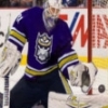
gorlab 4,321 Posted November 10, 2014 Share Posted November 10, 2014 Seattle Bears So this bear looks really pissed. And, to top off the theme, ANOTHER SHIELD. It's a freaking trifecta. Or is it an oval? Either way, I've never seen a bear the colour of which that bear resembles. Is it some mutant bear that is really mad about being inside a lame shield/oval thing? That's probably the case. Maybe he wants to be separate from the crowd. Too bad, bear. Yer off the case. Grade: Who did this monstrosity kill to get a red fur coat? Scary. Maybe you will prefer this Bears logo, I know I do: Frank 1 Link to comment Share on other sites More sharing options...
RMiner57 23 Posted November 10, 2014 Author Share Posted November 10, 2014 Maybe you will prefer this Bears logo, I know I do HOLY SHIT. THOSE EYES. Link to comment Share on other sites More sharing options...
RMiner57 23 Posted November 10, 2014 Author Share Posted November 10, 2014 You missed one Which one? Link to comment Share on other sites More sharing options...
Molholt 2,185 Posted November 11, 2014 Share Posted November 11, 2014 bump Link to comment Share on other sites More sharing options...
Senior Admin Will 4,660 Posted November 13, 2014 Senior Admin Share Posted November 13, 2014 Content: 3/3 Hah, another enjoyable edition. I'm looking forward to the VHLM parts next week. I definitely agree with you about the Toronto logo, it seems really boring in comparison to the rest of the leagues logos. Grammar: 2/2 mod about it"? = mods about it?" Appearance: 1/1 Looks good. Add a title next time. Overall: 6/6 Link to comment Share on other sites More sharing options...
Kendrick 4,741 Posted November 16, 2014 Share Posted November 16, 2014 Claimed Link to comment Share on other sites More sharing options...
.png.ed69a7260a477fcf4feead7a0e4b7506.png)
Recommended Posts