.png.ed69a7260a477fcf4feead7a0e4b7506.png)


boubabi
-
Posts
16,793 -
Joined
-
Last visited
-
Days Won
119
Content Type
Profiles
Forums
Events
Articles
Posts posted by boubabi
-
-
-
-
The white jersey could have been great(or a white bg) but its great nonetheless
-
Clean render FX. SImple but nice -
-
-
Agreed
- Motzaburger, solas and Ahma
-
 3
3
-
-
On 12/6/2021 at 5:48 PM, JardyB10 said:
- The boubabi award voting controversy was different than you described.
This
It's unfortunate that some people think this is the story behind it. Don't know the person who said "how can he win with 1 vote" but thank you for pointing the absurdity of that statement.
Don't spread misinformation -

The famous koradek glare on helmet
-

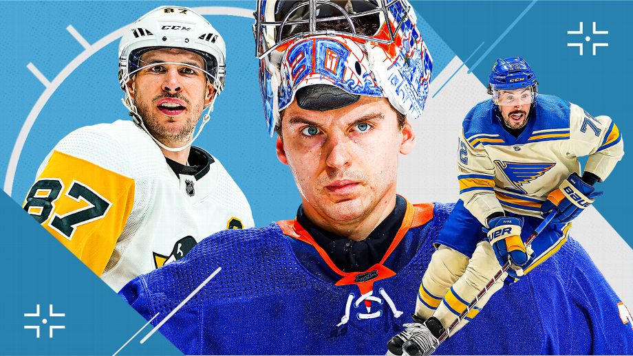
The FX are like 50great 50 terrible. Mcdavid looks great, but not kirill
-

Tsn is just lazy at this point lol -
the montage is good but the FX are overdone lol
The whites are clipped, so it's a good sign that image has been in one too many filters
-
Very nice. It uses some sig techniques in term of overlay textures
-
-
3 hours ago, Shindigs said:
Just join the dark side instead, we have cookies. And lots of saturation and cool effects. Usually it's just that it's "too much" and basically aimed at looking "cool" whereas professional graphic designers usually aim for "clean" and "professional" as more of their fighting words. But then that is usually because they aren't making forums sigs. If either of those posted graphics were forums sigs it would have been fine. But if they are marketing material for multi-billion dollar corporations, then that is really not okay. It's like you rocking up to a corporate meeting in your rave gear. There's nothing wrong with your rave gear, at a rave. It's just that in a corporate meeting it would make you look like you're 12 and lost. That's about the closest comparison I can make.
Edit: Like if I showed her my forum sig she would facepalm. And rightfully so, because it's meant to be over the top like forum sigs should be. That's been what they've looked like stylistically since before some people on these forums were born. Because back then making something that looked that flashy was so hard in like Photoshop 5. That it was a flex just to be able to produce the effects. Eventually it became part of the forum culture, so here we are.
This.
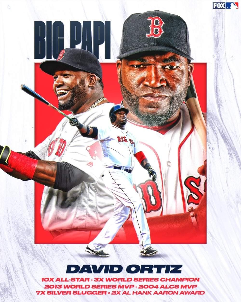
The goal is not to roast, don't get me wrong. It's more about graphics that I either feel are lazy or have little to no design to it. Tbf, the matthews one is not that terrible design wise, there is just flaws that are easy to fix/poor decision.
First and foremost, it's over sharpened, the cyan/greenish color from the spark around the renders are terrible/doesn't fit, Matthews eyes are messed up on the smaller one and the face is over saturated/burned on the main render. That's a strikeout.
On the other thread with images that aren't terrible, it's more about the design and the message. The patriot one is super clean as the render fx are interesting, the layout is interesting and there's enough content to it. Less is more, that is still true. -
6 hours ago, Frank said:
We have different definitions of terrible.
Overly saturated and over doing topaz shouldnt be a paid job imo
-
-
-
-
I'll post some horrible online graphics that I found over time. Aka, don't do this kid
-
-
I'll post some in here. Feel free to contribute
-
Was expecting Papa Johns, ngl


Which collab sig is better?
in Graphics Ranks
Posted
Bumping but collab sigs are a great way to interact with other artists. Those are great