-
Posts
16,793 -
Joined
-
Last visited
-
Days Won
119
Content Type
Profiles
Forums
Events
Articles
Posts posted by boubabi
-
-
Can't we use html or bb-code anymore @Will ? The UI is terrible
-
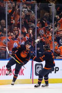
Not everyday that you have HQ pictures of shiny buckets
You can ask me for some pictures HQ as well if you want some. Just need the date of the game -
-
-
The glare is a bit too strong/distracting. Higher up and a bit more subtle should do it.
Bg and render blending is nice. A smaller more discret font could be cool as well
-
Background doesnt match the look and feel of the render
Render fx are a bit overdone, it makes it look like the render is LQ
Blur the BG and color match it to the render tone and it should be gucci
-
-
Graphic reviews being inconsistent? Since S1 baby
-
The jagged edges on the font ☠
-
The font is really bringing this down. It looks like soneone just added a layer on top of your graphic to make it about his player lol.
During my livestream, I talked about how I try to build my layout as soon as possible, before any FX and lighting. Therefore, I put the render and then I immediately work on the text. It gave my results that made the text a bit more incorporated to the sig.
In this case, fire being the general theme, you could have worked with something that disintegrate or with some fire sparks.
Text is difficult but it is mainly what will bring your graphics to the next level
-
-
-
good choice for the logos
- DollarAndADream, JardyB10 and Nykonax
-
 2
2
-
 1
1
-
The idea was good, but the execution is lacking. By that, I mean the effects you went for were interesting, but in the end, they just make the sig be all over the place.
The font is hard to read, the wiggles fx is not really working. The grunge textures on the right side plus the render fx makes the render look LQ.
The left side is interesting but if you want to split the sig in half, the right side should be a continuity with a different twist instead of a completely different sig.
-
-
The V is a bit redundant but the eagle is nice. You could try the eagle only or the eagle inside a shape, which is very European ish
-
-
-
I'm not active because I don't have a player lol
The ship has sailed for me unfortunately. I no longer care enough
-
On 6/15/2021 at 6:33 PM, Esso2264 said:
i dont like the berlin logos
Love u homie, but if its a real criticism, you gotta explain why and maybe recommand something.
From a gfx/creative stand point, this brings the discussion no where other than negative energy- mattyIceman and rory
-
 1
1
-
 1
1
-
Needs more cigarette and berets
-
Dope sig homie
-
It needs more surrendering. Maybe a white flag somewhere
-
Da fuck is going on lmao
- Da Trifecta and solas
-
 2
2
.png.ed69a7260a477fcf4feead7a0e4b7506.png)





Additional Affiliation Possibilities
in Announcements
Posted
If I'm getting ban in one league, do I get a ban in all leagues????