.png.ed69a7260a477fcf4feead7a0e4b7506.png)


boubabi
-
Posts
16,793 -
Joined
-
Last visited
-
Days Won
119
Content Type
Profiles
Forums
Events
Articles
Posts posted by boubabi
-
-
You added mediocrity fo sho

-
i voted for the goaltender because 2100 saves is very good
He saved like 2100 goals. THATS INSANE
2100 goals saved > 35 goals scored
Amirite
-
-
I would argue that the first image, he's going further from me but I see your point
gritty isn't even the best mascot in his town
-
-

Yea boi
-
11 hours ago, Victor said:
Greatest mascot of all time

-
Fuck the commish comin' straight from the underground
-
-
the first type font was better imo, not sure a old english style works really.
I had something like this


and the bg is cool, I like it better that way
-
not sure about the drop shadow. We can see some aliasing on the render so its probably a little bit over sharpened or lq. We can see some of the BG on the cut for the helmet, so that could be cleaned a little bit further. Not huge on the color scheme, as the face stands out a little bit too much, a b/w version could be better
-
The foundation of the idea is good, but I don't think the VHL has the ressource to execute perfectly the idea.
First of all, even though some member has some logo design basic knowledge, we arent really tooled like a professional graphic designer. Even if the logo was perfect, some people won't like it for some reason. From my VHL experience, people are afraid of changes and would rather keep something familiar but ugly than new and superior (see the calgary logo)
From my stand of view, I would consider the criticism of 1 professional logo designer over the opinion of 100 members with no experience with that. I know we like to think its part of the democratic process, but it really shouldn't for those type of things
In my opinion, if we want to take a step further in branding those teams, all teams should have :
1. the official ai logo available for download
2. an official color scheme for jersey and shits
3. an official typeface/ logotype for the franchise
4. a secondary logo/secondary jersey
all those in vector formats of course
So if that's the goal of the committee, why not. But otherwise, I think its quite hard to give feedback when everyone has their own (even though they might not be good ones)
-
The red font doesnt work. The red areas on the render are oversaturated. You could add a slight rim light on a side of the render to blend it better with the white bg, like he was backlit
-
Not huge on the stroke for the player but I like the concept a lot. The text on the right side could be a different typo, (maybe higher length, a little bit tighter) and behind the render, but it works as it is anyway. The background image could use a bit more pop, or do the opposite and be very subtle and blend it with a white background
But still a solid sig. The concept is nice, which is a huge plus
-
2 minutes ago, flyersfan1453 said:
White THEME > Black THEME
slow down donald trump
- Da Trifecta and mediocrepony
-
 1
1
-
 1
1
-
3 months of work for 6 tpe.

-
It feels like 2012 again
but still far superior than the precedent
-
On 6/15/2020 at 9:11 AM, Beketov said:
Leaving a comment so I don’t forget to watch this later. Years of Boubabi giving me GFX criticism so now with him in my world it’s my turn


-
-
the mix of light grey, dark grey, black and white doesn't really work here
its a bit of a fuckfest
-
-
14 minutes ago, GustavMattias said:
The real challenge is using every one of those stocks in one sig.
somebody already done this for sure
-
-
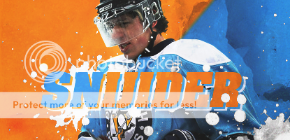
the splatter brushes


 and borders. what a try hard (thats me lmao)

 black c u m and the lines. double trouble

Things the League Added Because of Me
in VHL.com Articles
Posted
Yes I have a multi somewhere.