.png.ed69a7260a477fcf4feead7a0e4b7506.png)


Dolant
-
Posts
123 -
Joined
-
Last visited
Content Type
Profiles
Forums
Events
Articles
Everything posted by Dolant
-

-
Review: The render is decently well cut out but putting it against a black background was not the best idea since you can see it having sharp edges(the render). I like the placement and usage of team logo tho very cool. Text placement was nice but could of used some effects like outer glow/stroke and if you can get a bit more creative backgrounds from sites likes pexels etc.. Good stuff tho keep trying. 7/10
-
Review: Nice clean render, looks like you going for the painting vibe I like it. Cool background fits in well with the color scheme. I like the font choices fit in well and the placement of the text is nicely put. Could of kept the same text opacity tho don't really dig that one. Good stuff overall. 9/10 .
-
1. I was top 10 in game winners but now I'm not anymore. 2.I just want something big to fill my ego in 3. Take it - By The Seige. It just motivates me to take what's is mine and our teams...DA MONEEYYYY and trophys 4. "Whatever the result of todays match is remember, nothing will change in your life, your family will still love you, your friendships will stay the same and only a small percentage of the world will care about the result of this game. Now go out there and have fun." 5. Boat cakes..yes. 6. Nope the lad doesn't have ay catchphrase sadly. 7. Being one of the best offensive players in the big leagues 8. I just post a lot of memes and keep the gorilla persona going but its fun for me so win-win.
-
I still had pending updates but oh well.
-
Review: I like the render cut out very clean besides the helmet being a bit fucked, good resolution. Background fits in well with the renders color scheme so that's a dope feature. I like the font choice makes it feel like a signed banner good color choice too. Solid work lad, simple and good. 9/10 good job lad.
- 1 reply
-
- 1
-

-
Review: I like the render cut outs looks nice, not bad placement too. The background fits in well with the color scheme of everything I dig that. Font is a bit basic and text could of used less effects on it its too bold. Some drop shadow would of been enough maybe some blue outer glow too. 9/10 good stuff
-

-
1. Dyl, being dyl is his most annoying quirk 2. He watches tv while listening to sad music. He watches a rocky movie. 3. Mexico City lol 4. RW because easiest transition 5. I do not mind pineapple on pizza. I like all topings besides shrimp, shrimp pizza is shit 6. Probably VETUS cuz boats.
-
Review: Well cut out render, I like the positioning, maybe the resolution looks a bit sus. The background fits in well with the render. I like the light effect adds something to the graphic making it look nice. Text/Font looks pretty good against the background, I like the positioning of the text maybe didn't need the inner glow I think drop shadow alone would of worked well enough too but that's just me. Font is simple and bold I like it. 9/10 good stuff.
-
Review: Render looks well cut out, very clean. Background fits in well with the color scheme I like that a lot. Text/Font I am not the biggest fan of text in a box style but the font is cool and it fits in well with the color scheme of the gfx. I like the effects on the render it makes it pop out well from the background. 9/10 text in boxes bad >:(((
-

-
1. Me, I'm the best player. 2. Definitely above I thought you guys were going to be pretty mediocre this season. 3. Yes we already have a positive record versus them. 4. Yes I expected this amount of effort from him, we will get better with time. 5. Very good, we just keep getting better and better. 6. Probably still the guys right on our backs Saskatoon 7. Michael Hall definitely. 8. No clue I think you lad's are doing a great job. 9. Probably the King Kong game on the ps2 it was my first game and I still love it. 10. Whichever one I coach.
-

-
Review: Render looks decently well cut out, resolution is a bit bad if ya using photoshop when you press ctrl+t hold down shift when you change the size so it would keep the same resolution more or less. Background is pretty good, fits the color scheme of gfx, nice team logo placement too. Text/Font Font is alright a bit simple tho, text is well placed since I can't see where you would put it otherwise. As for effects the text could of used some rather then the renders exploding feet, should of put some white stroke effect at least on the text or some outer glow. As for the exploding feet comment don't think it was necessary feels like you did it just to do it and fill the place out. 6/10
-
Review: Render looks well cut out good stuff, I like the placement of it(Can't tell if its an actual render cut out or not but because of the outer glow I'm gonna assume it is). Outer glow on the render could of been a bit less seems a bit much. Text/Font nice font but I feel like the text could of been positioned better. Nice background blur makes you focus on the render. For effects besides the glow and borders nothing else but that's enough for this kind of simplistic look. 7/10.
-
1. That we are goated getting ez W's 2. Me I'm the best I'm MVP obviously lol 3. Great because I'm the greatest 4. Being more great then now 5. M- I mean Joe Kelly 6. So far so good looking to make it more lethal when he gets the puck. 7. Definitly "great" 8. Most recent one versus Saskatoon Wild 9. Yeah started last week, pretty fun. 10. Caula-rAWdo definitely
-
10+ Dolant Fertitta
-
Review: Nice clean render,I see a little logo on top of his head cool little detail. Text/Font color fits in well with the render color nice and simple. Background is very simplistic but it looks like you were going for the simplistic laid back look I like it, with the logo included decreasing the opacity makes it look apart with the background some coolio stuff here. Not a lot of effects besides the light coming from the corner it fills the space well. Overall I like it looks simplistic and nice to look at for the eyes. 9/10.
-
Review: Render looks pretty clean, I like the little light at the top of his head makes your eyes go there first. Background fits in well with the color scheme and the text/font also fits the theme of the gfx but it doesn't pop out well feels like it could of used a slight stroke effect. So yeah everything looks clean besides the text/font doesn't vibe with me, good shit otherwise. 8/10.
-
1. Easy W's baby! 2.They were great because you got me. 3.Higher defo thought I would go lower since of my lack luster performance. 4.Dylan because he is goated. 5.Mexico City Kings lol. 6.Going for a strong playmaker and then maybe in the higher leagues I'll branch out my passing game more. 7.Be better than Dylan. 8.Number 1 baby we goated. 9. Pittsburgh penguins definitely. 10. "Guh-raj" easy.
-

-
Yes.
-
Review: I like the render looks clean. Background fits in well with the color scheme or the gfx. Text/Font looks cool as well, I like the positioning of them making "telker" bigger bringing attention to it. Not sure about the blue light near the renders left arm tho. Overall looks pretty cool, but the render itself feels a bit small, space could of been used up more. I like it lad 9/10.
-
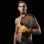
Nicholas Sunderbruch Draft Graphic
Dolant replied to NickSunderbruch's topic in Archived Graphics/Videos
Review: Don't believe the render is cut out pretty sure you just took the image (If it is a cut out then it looks dope). I like the filter adds a nice cold feeling to the picture. As for anything else for effects I like the jersey swap. And the text/font is pretty nice with "Toronto legion prospect" but the black text on blue doesn't fit too much could of put stroke effect on it or just make all the texts light blue. 6/10.


