.png.ed69a7260a477fcf4feead7a0e4b7506.png)


Eynhallow
-
Posts
1,327 -
Joined
-
Last visited
-
Days Won
1
Content Type
Profiles
Forums
Events
Articles
Everything posted by Eynhallow
-
I have similar comments to what has been posted above. I like the brick wall with the Wolves logo superimposed. Good use of transparency here. The overall color scheme works. Nothing clashes. I likely would have tried to balance the players names, but that's only because I like things to look organized. Your choice of fonts here was good in that both names are easily read. As above, I thing a logo swap would be a nice addition. Also note that when you flip an image you also flip any writing or logo elements, so "LA" appears as its mirror image. Nice concept, but need some refinement. 8/10
-
Great graphic @Ledge as usual. I like the overall gold theme, especially the nuggets in the background. Nice use of the Mexico City Kings logo on the background as well as a very good logo swap/application to the players jersey. You have a good choice of font. It is easily read and the colors blend into the overall graphic quite seamlessly. I likely would have centered the players last name as opposed to having it left justified as you have done it. A minor suggestion for a largely great graphic. Nice work. 9.5/10
- 1 reply
-
- 1
-

-

Questions for people to answer
Eynhallow replied to IHateBobNutting's topic in Player Press Conferences
1. What aspect of Hockey (Defense, Stick Handling, etc.) do you think is the most underappreciated? I would say Defense, It seems as though STHS is slanted towards offence. You frequently see a defenseman near the top in scoring. In RL, that doesn't happen all that often. 2. The NHL has the Lady Byng Memorial Trophy for the player who exhibited outstanding sportsmanship. What should the name of that trophy be in the VHL? I wrote an article about this some time ago. My suggestion was that it be called the Madonna. 3. Who do you think deserves to win the award this year? Hard to say as the league hasn't yet been fired up. And with the redistribution of TPE, another wrinkle has been added. 4. Who do you think is your team's MVP this season? Well, at the moment I haven't been placed on a team, so I really can't say. 5. What is your favorite holiday? In Canada we have a holiday towards the end of May. It is called Victoria Day. I like it because it signifies the beginning of summer. 6. If the VHL has an expansion, what city would you like to see get a team? I made a play to have a franchise established in Swords Ontario. I stand by this. -
Accept. Thank-you very much
-
This is mind-boggling. There were players drafted into the VHLE that had 35 TPE fewer than Noodles. I mean, c'mon man....Noodles showers on a regular basis !!!
-
Maybe a PTO.....anyone ?????
-
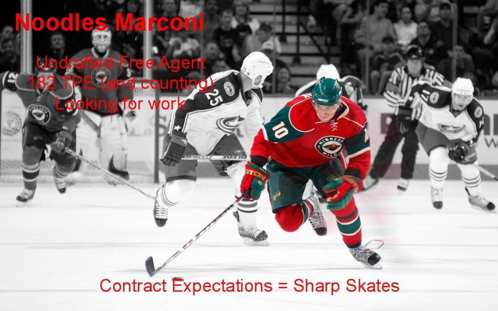
This isn't an article. It is a ad for a job. I left the TPA below 200, but can go over 200 easily. User: Eynhallow | TPE: 202 (3 Banked)RW | 6' 0" | 187 lb. | Age: 21 | | Free Agent DK SH PA BC GR FO PC DC OV SP SS WS LD FG PO EX TPA 23 23 13 0 0 0 23 23 23 23 24 24 0 0 0 40 199
-

-
Another very effective graphic. What initially strikes me is how you have managed to get the background colors and the jersey colors to be so much the same. That give the whole graphic a color tone. You have used nice contrasting colors in your text. That makes it very easily read. You do lose a bit of the double "L's" in Hextall however. Yous choice of render shows some dynamism and intensity. I like the overall feel to the graphic as well as appreciating its simplicity. A graphic does not have to be "busy" to be appealing. Nice work. 8.5/10
-
I like what you have going on here. Firstly, the non-hockey theme is a nice touch. Graphics like this are quite a bit different that the usual hockey player character. You choice of caricature is way cool, ya gotta love that off the wall stuff. I also like the color palette that you have chosen (like the color of the guys shirt). It fits very well with the Legion colors. I am a big fan of cityscapes in the background. Toronto is unmistakable. Your font choice was great making the text easily read. Great Work. 9/10
- 1 reply
-
- 1
-

-
1. How did the VHL / VHLE draft go for you? Not very well, I am afraid. Noodles did not get drafted, nor was he picked up as a Free Agent. Difficult to understand given that he has 182 TPE and counting. 2. What do you think of the teams right now? I think the VHLM and VHLE teams are missing the boat in not acquiring the services of one Noodles Marconi. 3. Are you excited about next season? I might be if my player was, in fact, on a team !! 4. Do you think Mexico City can be competitive next season? Yes, absolutely. But they would be more competitive withNoodles patrolling one of the wings 5. What do you think is the perfect combination for a winning team? For a winning combination, I think you need a combination of great talent and effective leadership. 6. In your mind, what do you think the VHLM is all about? The VHLM is a great place for players new to the VHL to learn how to develop a player. As well, for recreates, it provides a platform to develop a new build.
-
-
Over the course of the past few weeks I have seen articles written here and on other similar sim/forum type games where folks have been stepping away due to burn out/ game fatigue. I have to say that "I get it !!!" I have been involved in forum-based activities since before some of you were born and I understand how a person can get so invested in a forum community that it starts occupying way to damned much of your time awake (sometimes even when you are sleeping). We try, at least in our opinion, to try to make the forum a better place. But we all make mistakes, or or efforts go unappreciated and in the worse case, criticized. As you all know, it's real easy to criticize from the anonymity of our keyboards !! In any event, to all of you who are experiencing this, I have been there, done that and even have the T-shirt. My suggestion to you is to step back a bit, but please don't walk away. These forums are a better place with you than without you !!
-
- 3
-
-
Pretty awesome graphic. I like the way it fades from one photo to another. I also like how you have incorporated the text, not only within the design as a whole, but also within itself. I like you choice of color palette, muted, yet effective. There is nothing that clashes. I also like the arena being in the background as opposed to some of the more "wild" backgrounds I have seen. A small suggestion would be to work on the exposed logos. Either swap or just paint them out. Great Work !!! 9/10
-
I quite like this graphic. Your choice of subject matter is great. It makes you wonder what this guy (Austin Matthews) is thinking at that moment in time. The over all blue color palette was well chosen. There is good contrast between the background and your text. It makes it easily read as well as drawing your attention to the players name. The flow of the graphic is also pretty cool in that your player is looking at the text. Good work !!! 8/10
-
1. New attributes, what is your reaction to the new system? Well, its a little more complicated, and the jury is still out on how the sim engine is going to react to all this. So I haven't really decided as to whether or not I favor this move, 2. What playstyle are you building for now? Essentially the same as before, but with much lower stats in each category. 3. How do you think this will impact the 3 leagues? Although the powers that be have said that there had been some testing done, as I mentioned above, I have to wait and see what happens over the course of the next season or two. 4. Do you think this will make games even more competitive now? To be honest, I think that there will be more parity as there won't be many skills that are maxed out. Meta is also more or less gone. 5. Spring is here! How's the weather? WTF...it snowed here yesterday !!!!!! 6. What is your favorite video game currently? I must be the only one. I don't play video games. (Red Dead: Redemption 2)
-

-
@Thunder Don't feel too bad. I was the same when I first started and it took an updater a minute to set me on the right course.
-
-
Florida Man Meta can't be stopped #FMM
Eynhallow replied to zepheter's topic in Archived Graphics/Videos
I like the simplicity in this design. Good work on applying a team logo to the player's T-shirt, that was a nice touch. I also like the Florida Man design in the corner. It took me a minute to get it, but it is really quite effective. Your player has an unusual expression on his face and I have yet to figure out what you are trying to convey, but that really doesn't matter as I like it anyway. Your choice of background is a little pedestrian. Something a bit or dramatic could be a suggestion. Keep up the nice work. 7.5/10 -
Straight Outa Mockba. Nice graphic. I like your choice of a blue background and overall blue tint as it represents the cold North very well. Your choice of subject matter was refreshing in tht you did not use a hockey player, and yet the sense of passion and intensity is definitely present. Your choice and colour of font for the players name is good. However, the material that is written in below the players name is a bit hard to decipher. It could be made to pop a bit more. Nice work, as usual !!! 9/10
- 1 reply
-
- 1
-
-
1. We got eliminated in round 2 by Houston in 7 games. What are your thoughts? I thought we gave Houston a pretty good run. That series could have gone either way, so we were very, very close ! 2. What do you think went wrong? Without getting into the vagaries of STHS, I think it was a combination of things, but mostly because we didn't bring our A game to Game 7. 3. This off season is the world cup and the world juniors. Are you looking forward to that? Not really, as Noodles is not participating in either affair. 4. Have you been following the vhl playoffs? If so, who do you think will win? Noodles is a recreate. My former player, Isau DaMoose has been with Riga for his entire career. It was great that Riga made a deep run in Isau's last season, but it is too bad they couldn't have gone all the way and reward Isau with a championship to end his career. 5. With the draft coming up soon, what are you doing to impress the scouts? Noodles is not draftable in the current year, so the point is kinda moot. In any event, Noodles will continue to work on his skillset as an offensively talented winger who takes his defensive responsibilities seriously. 6. Do you think we can make another run at the cup next season? No reason why not. There will remain a core of players that will help with that and with a good draft and maybe a trade or two, The Kings should return to the Promised Land.
-
Claiming Week 4
-
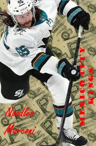
Hi Ledge. Please make me a sig, if you have the time Noodles Marconi Mexico City Kings.....to be edited to a VHLE/VHL team later. Any player will do. Thanks Eynhallow
-
I think the fire theme is just fine. It is certainly fitting with the "Phoenix" who rises from its own ashes, right ? Also, that color scheme makes your graphic nice and bright. Nice use of the cityscape in te background. It associated the team and the city quite well. Nice logo swap. It looks nice and clear. I also like the dynamism portrayed on your choice of player. My only minor suggestion would be to make your text a bit more distinct. I like it !!!! 8.5/10