.png.ed69a7260a477fcf4feead7a0e4b7506.png)


ke1vi
-
Posts
852 -
Joined
-
Last visited
Content Type
Profiles
Forums
Events
Articles
Everything posted by ke1vi
-
Just absolutely unreal and now I have the sudden craving for a rocket popsicle…
-
I really like the text on this - a nice cool effect with the displaced effect in the middle. The grunge effect is also really nice, however I think it would be better if you resized it to a standard sig dimension (200 x 400) and rearranged the text to make it fit. The background color and brown smudge goes really well with the red. As for the jersey swap, that's a pretty hard one to do since he's leaned over - but I think the logo needs to come a bit further down the jersey since its currently up to the strings. Great job though! 8/10.
-
This is your best sig so far since coming back. Love the white background with the purple pattern brushes to make it more of a 2D sig. Text is very nicely placed and the render placement is really good despite being a bit of an awkward pose for Laine. I think the logo on the jersey swap is a little too big but other than that there's not much I don't like here. 9.5/10.
-
-
old one I abandoned but revisited for a last minute 6 tpe lol
-
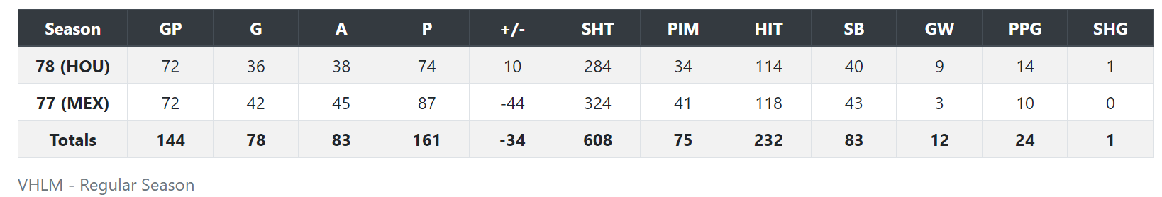
Anze Miklavz The Rookie Experience Day 1 of the S79 season and the final buzzer sounds. The Riga Reign win their first game of the year against the rebuilding Helsinki Titans. Anze Miklavz is aware of the slow starts in previous seasons for this Riga team – and with two goals (including the game winner) to kick-off his VHL career, he’s doing his best to contribute to a potential contending season for the Reign. Miklavz was drafted 15th overall in the S78 VHL Entry Draft – a somewhat surprising fall considering being ranked no higher than 8th in preliminary mock drafts. At this pace, he’s looking like the steal of the draft – and a sigh of relief for the Reign, who’s first pick in the same draft (Milk Jugs) has since left the league. “You have less than a second to figure out what you’re doing with the puck before it’s gone again.” Anze knows the challenges he will face ahead as he adjusts himself to a faster, harder and much more intense style of play in the VHL. Something he himself has picked up on pretty quick after his first couple games with Riga. “It’s an absolute grind to keep up with play – but I know I’m getting there. Scoring twice in my first game was great, and despite being pointless since, I feel that my defensive play has made up for it. The game is quick – very quick – you have less than a second to figure out what you’re doing with the puck before it’s gone again. I’m very glad I pushed myself this offseason to make sure I was ready going into this season”. Riga hasn’t played a playoff game since S75, and despite having a playoff roster on paper the past couple seasons, they have been on the wrong side of luck – especially last season when a powerful rally fell short in a tie-breaker with the Malmo Nighthawks. They also saw their star goalie Calvin Harvey leave abruptly to pursue a career in humanitarian aid. The disappointment of S78 is mutual between the Reign and Miklavz, with the latter coming off a VHLM season that saw a drop in both goals and assists from the season before. “Yeah – I was pretty disappointed in my performance. My primary focus was to play better defensively, and I think I did achieve that. But I was really hoping to be amongst the scoring leaders last season – a personal failure for me”. Anze Miklavz - VHLM Stats With the S79 season off to a good start for Miklavz and Riga, both are looking to close the door on previous failures and steer the ship in the right direction – and with rumors of a new Riga logo in the works, there are lots of reasons to be excited for the future of this franchise. Miklavz himself remains focused on the Stolzschweiger Trophy as rookie of the year – but more importantly he wants to help end the drought for Riga and bring home their first Continental Trophy since S72. “Riga has been so good to me – and I’ve seen how frustrated they were when the games weren’t going their way. They deserve a good run this year and I’m extremely glad to be apart of it. They have trust in me with my spot on the first line, and I’m hoping to continue to make sure I can pay them back for taking a chance on me with the 15th pick.”
-
Zamboni Driver @Advantage
-
-
Yea I love the colors and text to this. Everything is put together extremely well here. I think you need to add some lighting to add some depth to it however and make things pop out, and maybe a texture to the background would help as well. 9/10.
-
Love the grunge theme to this one and the shade of green is really nice. Lighting is also done very well. I would suggest making the render a bit bigger and add a bit more lighting to the face to really bring it out. Right now it kind of looks like the render is hiding behind the green splat foreground. It may be my screen but the Malmo text is a little hard to read for me, but the colors are still sick. 8.5/10
-
Lee Xin @DMaximus
-
Kasper Kankkunen @Advantage
-
Hahah shit I'm sorry, I didn't realized you made a pick when skipping NSG.
-
D - Kosmo Kramerev @NSG88
-
F - Dakota Lamb @Advantage
-
F - Aloe Dear
-
I would have never thought it would come this far back in S1. I’d check in all the time to see the place was active, but nice to be back with a player.
-
-
groovy, dude!
-
Original: Swap & Cut.. (hopefully you can see the small blue-ish tint added to the black to make it more Riga themed).
-

New Year, New Gear... The Trap is Back in the EU
ke1vi replied to BladeMaiden's topic in Archived Graphics/Videos
The Prague color palette is definitely my favorite. You did a really nice job on the jersey change, especially the skewed text to work with the angle that HK is turned. A couple things I would do to give the sig some more depth would be to 1) erase some of that swirl stock on top of the render and text to make both pop out, and 2) darken the edges a little bit more. Still a great sig though. 8/10. -
I like the creativity in this one and the unique color palette. It's cool to see deviation from a typical team color themed graphic. The rainbow stock on the text is a nice touch. I think this sig still lacks a bit of depth and think it would have been better to center the render, just a little too much dead space on the left side. Also would erase some of that low opac stock that covers the render to bring it out more. 8/10
-
-
weowwww… Welcome Driver and peace out Harvey ✌