.png.ed69a7260a477fcf4feead7a0e4b7506.png)


ke1vi
-
Posts
805 -
Joined
-
Last visited
Content Type
Profiles
Forums
Events
Articles
Everything posted by ke1vi
-
Instead of signing with the Hamilton Canucks in the S2 Offseason, J. McKelvie stays with Vasteras IK and wins their 2nd Championship in 3 seasons....
- 1 reply
-
- 1
-

-
1. Since the addition of Bastian Greiss to the roster, as a team we’ve been able to secure 6 wins in the last week. Is this a fluke or do you think we can keep the momentum going and get a few more? The latter. We've said all along that this team needed a goalie to win and the its proving to be right. 2. In your opinion, what could your GM and AGM do to make your time in Mexico more fun and enjoyable? No complaints here. I'm getting lots of minutes and making the most out of them as the leading scorer. 3. What is one strength and one weakness you’ve noticed with your player in this season so far? Strength - Scoring. If I'm not first, I'm definitely top 3 in S78 eligible players in goals scored. Defense - Minus forty something is not a good look. I believe that's worst on the team. I need get better at that. 4. If you were to be drafted into the VHL next season, what team would you want to be drafted to and why? No preference right now. To be honest I haven't been paying enough attention to the VHL to see which teams I prefer. As long as its a good atmosphere and I get minutes. 5. Our team is at the bottom of the league right now, in your opinion, why has our team struggled to find traction this season? This was a factor into my proposed rule change in last weeks presser. The roster sizes are scattered amongst the VHLM and I believe that needs more balance. Our team has had 4 active players for most of the season while the Hounds have 15+. 6. Tell me one thing that’s interesting about your players life! He still works a full time job.
-
This is really cool and a pretty unique design. I like the grungy window to show the city in the background and the grayscaled border. The jersey swap is pretty clean and the blue stroke text fits in really nicely. I would have made the Reynolds text match the jersey colors instead of the background to make it pop out though. Some additional lighting effects would have been nice as well. Still a very creative design though! 8/10.
-
Love this. The edit is much better too. I love the galaxy theme and how it blends in with the render to add depth. The color theme is nice, with that that bit of red in the background to match with the orange on the jersey. The first name text is a little plain and I think some more lighting could be added. Still a 9/10 though.
-
Now that’s a solid memory.
-
...Scott?
-
1. With two recent wins, what are your expectations for the rest of the season? Two more wins baby! 2. Is Bastian Greiss that good as a goalie or are we on an upswing? Check the VHLM leaders. This guy is going to be a first round pick. 3. Favourite place to eat in Mexico City? Los Pollos Hermanos 4. You can add any one rule to the league, what is it? At some point into the season, new players will get assigned to VHLM teams based on record or roster size. They also need a minimum amount of TPE to get assigned so they confirm they will be active. 5. Do we need a new logo in your opinion? Yes. Not the greatest logo in this political climate and doesn't really relate to a king or Mexico City. 6. We are entering a lockdown where I live....how have you been handling covid and all that comes with it lately? NL just came out of a short lockdown, but for the most of the pandemic its been pretty easy going.
-

Who's still around from old cup winning teams?
ke1vi replied to Victor's topic in Archived Media Spots
S1 - Vasteras (J. McKelvie) S7 - Avangard (McLovin) - best roster ever tbh also not sad at all to see neither of my players in the HOF .. pretty sure I retired McKelvie early and went inactive on McLovin. -
Review Honestly, this sig would look a lot nicer if you soft-brush erased that grungy stock in front of your text and render. The text and layout you have is awesome but that grunge stock makes it all a little too monotonous. With that being said, the grungy background is really nice, but erasing it around the focal point would add so much depth to this in my opinion. I'll give this a 7/10.
-
Review I absolutely love this graphic. The purple glow behind the renders really makes the whole thing for me. The text fits in perfect for both first and last name, and the those shapes at the bottom add a nice touch to it. The logo on the jersey fits really nicely as well. I feel like it could use some better lighting to add a focal point but that's minor. Normally when you see a double render like this, one is more distinguished as the focal point than the other. With that being said, you made both these renders in this blend in perfectly. This gets a 9.5/10 for me.
-
Tried to simplify it to resemble what NHL teams post for player milestones. https://imgur.com/a/gVZ3Cf7
-
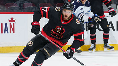
ANZE MIKLAVZ - RW - MEXICO CITY KINGS S77 Stats Overview Despite the abysmal showing from the Mexico City Kings, leading scorer Anze Miklavz is having a very strong start to his season. The Slovenian winger currently leads the S78 class in goals scored through the quarter mark of the year, which comes with a bit of luck from an inflated 14.63 SHT%. Due to the lack of skilled centers on the Kings this season, Anze has seen some reps in the middle and posting up average percentages in the faceoff dot. Although not known for physicality, Miklavz also leads Mexico City with 38 hits, which says more about the team’s lack of toughness than the player’s commitment to a chippy game. While Miklavz is carrying strong offensive numbers, his defensive game could certainly use some work. He currently holds an ugly -38 so far this season, and while the Kings goaltending is amongst the lowest in the league, the rest of the team only averages to a -20. Miklavz does see a lot of minutes and in some cases have played half the games. With a lack of depth and goaltending on the roster, it would be expected to see players with tough minutes sit in the minus. This does not void the fact that Miklavz is a liability in his own zone. In terms of underlying numbers Miklavz is looking promising so far, with strong possession metrics that sit at 54% CF. His 58% xGF at even strength is amongst the top in the draft class and teams with highly touted analytic departments will be keeping an eye on him. “The best winger in the draft” Pros A skilled, offensive threat with a strong forecheck that makes any opposing turnover twice as costly. With a lightning quick release and ability to change the angle last minute, there’s no doubt that Miklavz has the best shot in his draft class. Miklavz has a great hockey IQ and is known to see plays long before they happen, putting himself in perfect goal scoring position. A great personality in the room, as he has been able to keep a positive atmosphere in the locker room during Mexico’s 20+ game slump and awful season. Miklavz is a smooth, agile skater that allows him to clog the neutral zone when defending rushes. Cons Unfortunately, the high hockey IQ only exists on 2/3rd of the rink. Miklavz is a liability in his own zone and lacks potential awareness when opposing offenses apply pressure. Despite leading the team in hits, Miklavz is not known for his physical play and is easily out-muscled in puck battles. Miklavz will need to gain a lot more strength before making the jump to the VHL. Scout Quotes “He’s the best winger in the draft, no doubt. Give him an off-season in the weight room and it wouldn’t surprise me to win ROTY” – F.B – Virtual Prospects “As talented as a player gets, but needs defensive improvement. A very popular guy in the locker room. Someone you want on your team” N.A – Central Scouting “Too much potential to pass up on in the first round. I’m worried he may end up having all the tools but no tool kit. Only one way to find out, however.” F.K – Simon T Scouting “Sometimes looks nervous. Palms gets sweaty, arms look heavy, week in the knees which can lead to him losing himself out there” M.M – Shade45 Prospects

-
good trade
-
#PrayforMexico
-
1. Besides getting a goalie, how would you improve our team? Getting more players, we have a very small roster compared to the rest of the league. 2. What is your favourite Hockey moment of your lifetime? Scoring my first VHLM goal. 3. If you didn't become a professional hockey player, what would you have been? an Instagram model. 4. If you could choose a new location for a brand new VHLM team, where would you go? Bishops Falls, NL 5. Favourite Hockey movie or show of all-time? D2 6. Any weird superstitions you have when it comes to getting ready for a game? Eat skittles before every game.
-
+10 Anze Miklavz
-
Transaction ID: 20577682620461154 $1 Million in Player Store
-
Review This is your best sig (in this generation). The font is awesome and the lighting is perfect on this. The scan lines work well with this too. I like the small touch of red in the stocks, lighting and in the text. I would have made those black borderlines thicker to make it look more intentional and part of the sig. 9.5/10
-
Review I'm going to describe my rating based on the assumption you used photoshop, but let me know if I'm wrong. Seeing that it's your first sig, it's nice to see you understand some of the basics (brushes, text, render formatting). It's definitely a great start. Eventually you should get the hang of using some stocks and blending it in to add some more depth. I believe there's a page here somewhere that has some tutorials that will give you a some understanding on how some of the effects you see are done. I'd also head my way to dafont.com, as that is the database to see some nice fonts for graphics. As for the sig itself, I like the smoke effect at the bottom to provide depth, as well as the shadow effect you added.to the render I would have put your render on the left side though based on the direction he's looking, but that's personal preference. I'm going to give a 6.5/10 for now as a benchmark. I'd like to see you make another
-
https://imgur.com/a/XrKvn2P
- 1 reply
-
- 2
-
-

-
Review The colors are really nice and match with the Pens/Vasteras jersey kit. I love the flare looking stock. Would have been nice to see a jersey swap showing the Vasteras logo. I would have darkened the edges a bit more and made the font a lot bigger since the sizing of the sig is pretty big. 8/10
-
Review I really like the background you used. The colors match well and the sizing of render and font are nicely proportioned. I assume you made the other two in your signature, and IMO its the best of the three. I would definitely try to make the text pop out a bit more (lighting helps). If you are using photoshop, try adding some depth by soft brushing some areas and reducing opacity. I think another grayscaled stock with lowered fill/opacity would help as well. 7.5/10
-
Transaction ID: 20572206672116270 Doubles Week 5 Uncapped TPE
-
1. What are your thoughts on our interesting start to the season? Nothing wrong with production, but the team, including myself, need to work on keeping the puck out of our net. 2. What goals do you have long-term in the VHLM/VHL? To be an all-around offensive weapon, but to also win a championship. 3. Anything management can do for you and your player? Provide me every opportunity for TPE.. uhh I mean training. 4. If you could bring in any player to Mexico City, who would it be? Any guy who comes with a set of pads, a glove and a blocker. Helmet optional. 5. Favourite postgame meal prior to a Mexico City Kings game? This question is a paradox, but nothing wrong with some butter chicken before or after a game. 6. Biggest pet peeve? Hitting the post.


