.png.ed69a7260a477fcf4feead7a0e4b7506.png)


boubabi
-
Posts
16,793 -
Joined
-
Last visited
-
Days Won
119
Reputation Activity
-

 boubabi got a reaction from enigmatic in Another short film
to finish my degree in 3d animation, I was part of this
Cheers
-

 boubabi reacted to solas in Ode to overused stock
An all time classic, I remember erasing the logo from the bottom right corner of this stock in GIMP in like 2012. Cum splatter was great too, even non-GFX people would always bring it up whenever a sig had white splatter in it haha.
(also @boubabi that Selanne sig is gorgeous btw)
-

 boubabi got a reaction from Motzaburger in Ode to overused stock
its not a stock but
that type fx
@gorlab still love your sigs brother
-
 boubabi got a reaction from Motzaburger in Ode to overused stock
Hello
With the discussion I had on discord, I wanted to share some stock that some OG gfx probably remember. If you find a sig using it, show them to us. Here's some exemple. You can post some of them as well
(blame me)
(the fucking borders)
-
 boubabi got a reaction from gorlab in Ode to overused stock
its not a stock but
that type fx
@gorlab still love your sigs brother
-
 boubabi got a reaction from rory in Ode to overused stock
and borders. what a try hard (thats me lmao)
black c u m and the lines. double trouble
c u m drip found x5
-
boubabi got a reaction from rory in Ode to overused stock
Hello
With the discussion I had on discord, I wanted to share some stock that some OG gfx probably remember. If you find a sig using it, show them to us. Here's some exemple. You can post some of them as well
(blame me)
(the fucking borders)
-


-
 boubabi got a reaction from mediocrepony in a new web banner is better than a side banner tbh
Blue team be like :"here's your 0.25 uncapped tpe"
-

 boubabi got a reaction from solas in freeman.
Minus the text, I like it. The text is dull, it doesn't really stand out. It's not "BAD", but like, it doesn't do justice to the sig. I know the stroke behind the text is like the apple pie of the text work, but I don't think it works in here
The bg could be a little bit off color for the render to pop a little bit more, but it's not like distracting either
-
boubabi got a reaction from gorlab in The Joke Thread
Why you don't give a watch to a woman
I ain't finishing this joke
-
.thumb.jpg.32657f240eb71cc5cbc960ba77d35071.jpg)
-
boubabi got a reaction from mediocrepony in The Joke Thread
Flyers goaltenders in the 2000s and 2010s
-
 boubabi got a reaction from eaglesfan036 in The Joke Thread
Flyers goaltenders in the 2000s and 2010s
-

-

-
 boubabi got a reaction from gorlab in Gary Neal Collection
On those 3, the render efx has the same problem. Its a little bit over saturated and the colors looks burned. Have you used the color dodge/burn technique on the face ?
I think the 3rd is the most interesting in term of visuals, but the 1st one is clean as well. Not huge on the lower case gary and uppercase Neal for the 2nd one. I think both of them should be either uppercase or lowercase.
I'm nitpicking here tbh, I still think those are pretty solid sigs
Keep this up hombre
-
-
-
-

-

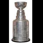
 boubabi got a reaction from Da Trifecta in S71 League Championship Banner Vote
People are more transparent with their voting for a new banner than the slobo
My proposition, free the puppies
-
boubabi got a reaction from Motzaburger in S71 League Championship Banner Vote
if I had to choose tho, I would go 1st because the concept is superior, but without throwing shades, I feel like those 3 could be polished a little bit more
-
boubabi got a reaction from Motzaburger in S71 League Championship Banner Vote
People are more transparent with their voting for a new banner than the slobo
My proposition, free the puppies
-
 boubabi got a reaction from ColeMrtz in S71 League Championship Banner Vote
if I had to choose tho, I would go 1st because the concept is superior, but without throwing shades, I feel like those 3 could be polished a little bit more


.thumb.jpg.32657f240eb71cc5cbc960ba77d35071.jpg)


