.png.ed69a7260a477fcf4feead7a0e4b7506.png)


jhatty8
-
Posts
1,370 -
Joined
-
Last visited
-
Days Won
5
Content Type
Profiles
Forums
Events
Articles
Everything posted by jhatty8
-
(imo) this isn't the best advice. Generally you don't want to cornerlock your text, instead keeping it next to or on top of the render so both of the focal points are in the same place. If they're far apart or the text is awkwardly placed, it draws attention to too many areas.
-
drawing your eye to absolutely nothing is brilliant
-
The Man U one is pretty awful. Especially the weird attempt at the text reflection. Matthews isn't bad at all, just too much HDR
-
 Also want to add on that it goes both ways. GMs should have enough trust in the Moderators to correctly handle situations as part of their job, and that trust can be reciprocated with locker room access. But as evident by some of the answers given in the form, that level of trust isn't quite there.
 -
From an (somewhat) outsider perspective, I think that GMs should have enough trust to simply run their own servers if they have enough trust already to make managerial moves as a face of the league. I understand your perspectives on wanting to know what's going on as the LRs are a direct connection to the VHL. That being said, if the coach doesn't want to let their superiors see everything they are doing with their team at any given time, that's their choice to make. Frankly all the Mods that I know and have talked with seem like amazing people that I would definitely invite to my LR if I had one. At the same time, that shouldn't mean everyone has to let them in. It's flawed to try and establish Mods in every LR on the basis of potential CoC violations. That should be the exception, not the rule, if you have faith in the GM hires.
-
A lot of reasonable takes here so far. No need to burn down the thread...yet
-
2 is the clear standout imo
-
VHL 12 Capped TPE Speed Run Challenge
jhatty8 replied to MubbleFubbles's topic in VHL League Discussion
Also, I use a trackpad and don't know where things are in the VHL. Someone should take this down easily.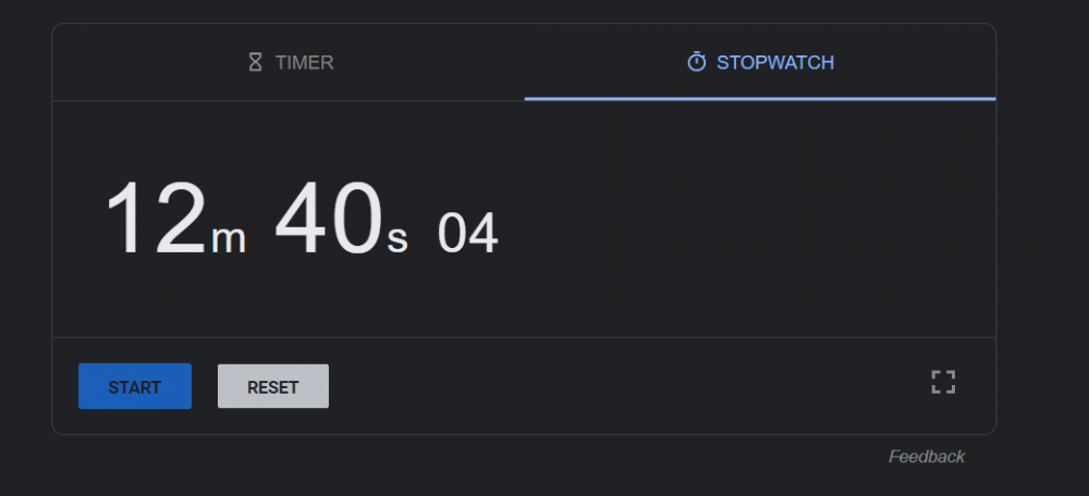
-
VHL 12 Capped TPE Speed Run Challenge
jhatty8 replied to MubbleFubbles's topic in VHL League Discussion
for the video - you can't see my Photoshop open. However you can see when I use the brush tool, eyedropper, etc. Very weird recording and I'll use Photopea next time for more authentication. And the record falls This could definitely be taken under 10 minutes with practice and optimization. This 100% brought more fun to the Sunday update grind, thanks @MubbleFubbles for the killer idea.
-
Review This is certainly an interesting piece, different from what I've ever seen you make. Border effects are pretty sweet, they work well. Background and render work together nicely and the text is great. My main critique would be to ease up on the filter. It overtakes the graphic too much imo. Also, stick with full opacity for the text here. 8.5/10
-
Review The effects on this sig are dope. Colors are nice, lighting is some of the best I've seen from you. The background and paint splatters compliment each other well. If you removed the text, this would be top-tier. Text is holding this back though, looks slapped-on compared to everything else. If you fixed it up a bit, this would be a 10. 9/10
-
1. Hopefully there were some Helsinki awards winners! 3. First full season in the VHL, hope to do what I can. 4. Title or bust right? Nah, but hopefully a big improvement. 5. I would go with the snail. Floating at any pace would be cool. 6. Stamina on the ice. We gotta make sure our bodies are in top shape. 7. Doing a speedrun here. Why did the chicken cross the road? To get to the other side.
-
VHL 12 Capped TPE Speed Run Challenge
jhatty8 replied to MubbleFubbles's topic in VHL League Discussion
@MubbleFubbles No affiliate PT either? I'm definitely doing this later today. -
So you're saying Ledge_And_Dairy is up for grabs now?
-
excited to earn 8-10 TPE a week instead of 6-8.
-
I like Ledge's more.
-
so many people with new name colors
-
vote JERICHO
-
Official “what do you do for a living” Thread
jhatty8 replied to Beketov's topic in Off-Topic Discussion
joined the VHL when I was 14, but been in sim leagues since 13. -
unvote omgitshim
-
vote omgitshim
-
selfish reasons, it was a coinflip between self and Gustav but I wanted to ensure that I'd keep playing lol