.png.ed69a7260a477fcf4feead7a0e4b7506.png)


Triller
-
Posts
1,244 -
Joined
-
Last visited
-
Days Won
22
Content Type
Profiles
Forums
Events
Articles
Everything posted by Triller
-
Couldn't let him ruin the illusion! Lol
-
Lookin pretty good! I like the logo replacement you did! I think the shoulder logo lends itself to a replacement as well but it's not necessary! Like you said, the Oslo logo in the text is really cool! I think the only thing causing some issues with it is the background graphic. It looks to add some confusion and muddy the logo in the text. A more subtle BG might work well for this to help both the player and text pop a bit more. Good luck with the next one! You are definitely starting to build a library of ideas and techniques that will only get better as you use them! 7/10!
-
I decided to stray from my usual 3D and try my hand at some 2D logo replacement! I usually do my reviews on the graphics everyone posts so I decided I should give everyone something to shoot at as well. I went for a photoreal replacement to try to get something as close to real looking as I could. I added a gif so that everyone can see what I started with to get to my end image. I used our teams players names and numbers to replace the OG ones as well as gave the coaches a little embroidered pocket tag to shout out our GMs! Replaced the boards ads with my KGW stick company and the VHLM logo. Replaced the ads on the glass behind the bench as well. I wanted to make it so you couldn't tell what team it used to be in any way even though I am providing the original too!
-
I agree with this. I like doing graphics and already put myself in a time constraint doing 2 a week. When theme week rolls in, it is tough to pivot and try to wedge it in without prior notice of what the theme actually is. That is likely on me and maybe I just pull back on the quality for theme week to get by but that isn't really my style.
-
Vancouver Wolves mid-season prospect report
Triller replied to VattghernCZ's topic in Archived Media Spots
I've not tried a review of a media spot but lets give it a go! I think the best parts of the league are the draft and anything that has to do with prospects. New players are always happy to see others writing about them and their careers. I appreciate you taking the time to do the research on each player and really going in depth on how they play and when we might see their debut in the big times! Only thing I could suggest would be to @ the users mentioned in the article to let them know their player is on your radar. Frank did it below but it is always fun to see your player mentioned! Maybe add some color in the text as well. It would be cool to see each VHL team do this as it would help drafted players know what their team might look like before they make the jump! 9/10! -
No worries, but yes, you never know!
-
I appreciate the review! Thanks for checking out my stuff! Unless you know something I don't, I am off to Geneva next season, then to London in the VHL after that!
-
-
- jacobcarson877, Ahma and MubbleFubbles
-
 1
1
-
 2
2
-
This is a very cool layout for a graphic! The vertical text makes a great center border and allows for the faded team logo in the BG to still stand out. Your logo swap on the left cutout is really well done! Much harder to do on a profiled angle but you nailed it. I like the desaturation on the players face but it does add a bit of confusion with the jersey as it is also grey. Keeping the face saturated might make the grey on the jersey look more intentional. The hdr contrast on the right render looks nice but it does make the overall graphic not as cohesive in its style. Only thing I would have done on the right render would have been to swap out the NHL collar logo with the VHL logo. I like the small details! Overall I give this a 9/10. The layout is very cool and the logo swap difficulty bumps it up! Good stuff! I look forward to more!
-
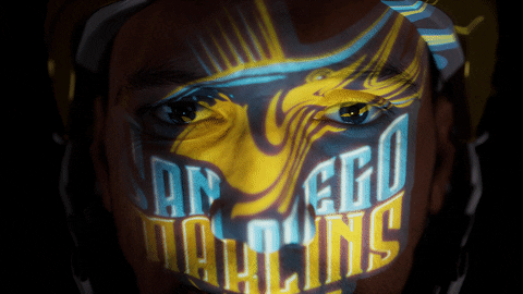
You'll be swimmin with the fishes!
-
With the Marlins playing like they are, away crowds are silenced more often than not! Shhhhhhhh! (I am aware he is in a home jersey... maybe I am working on an away jersey?)
-
Great change to allow the Bio to be completed whenever!
-
1. Feeling really good with our position in the standings! Should finish on top of the league with an amazing record if the trend continues! 2. I think if the line matchups keep working, we should be good! Even with our backup getting some reps, we can hold our own. 3. No surprise there. This league is volatile and their last season success seemed to come from some late waiver signings rather than a well drafted team. 4. Mexico City I'd say! Lost to them twice and they are second in or conference. Strong team! 5. With how much movement there is with the lines, I am happy with what Leonard has done so far. Either way, he is already drafted lol 6. Flat and if it is thick, I am the weirdo that will use a fork. I don't like getting messy while I eat!
-
I'm so confused! Lol Was this a make your own mad lib or generated by an AI?
-
Very nicely done! Love the giant smile of the player. Seems like you'd only get this from an All Star game image or something like that. Small details always steal the show and the collar replacement of adding the VHL logo is done perfectly! I really like that. The color composition is muted well using the grunge overlay. The signature is simple so it doesn't steal too much attention. Very cool background! If I am not mistaken that is the "Fibonacci Spiral", often used as the mathematical visualization of the "golden rule" of photography composition. Awesome stuff! 10/10 for me! Achieves its goal!
-
Praise be to Simon
-
Always have to do some animated logo's for the team! 50fps version here: https://i.imgur.com/lrWDeLG.gifv
-
Tried out something different than I am used to this week! I am no animator, but I decided to give facial animation a shot which is not where one should start when it comes to learning animation. I hope for a quick app solution to come out for facial motion capture that is compatible with the unreal metahumans but for now, here we go! Higher res here: https://i.imgur.com/YNSPRlF.gifv
-
That trend with people stepping down from VHLM GM
Triller replied to Shindigs's topic in VHL.com Articles
Even if I could just claim it as a review I would be good with that. -
🔥Ash Sparks⚡️ - Prospect Scouting Report
Triller replied to DarkSpyro's topic in Prospect Scouting Report
Massive post and a very comprehensive report! I liked the abilities you came up with, very creative! -
That trend with people stepping down from VHLM GM
Triller replied to Shindigs's topic in VHL.com Articles
I somehow can comment a crazy amount of words but find it almost impossible to write something from scratch to claim lol Should be a discussion point task that I can claim instead of a second review! -
That man is on my fantasy team! Nice work on this one!
-
1. Went well I think! Scoring more goals than I thought Leonard would, especially when he is supposed to be a playmaker lol 2. Nothing to improve on I'd say! Our record speaks for itself at the moment and everyone seems to be contributing. 3. Got a second hat trick and am above a point per game so I am happy. The team doing well is the main goal! 4. Not really. I am hoping to carve my own path to recognition with my graphics and activity on the forums. 5. Lower than expected. I am an Oilers fan so there is nothing but Lord Stanley's Cup ahead. Playing inconsistently and unfortunately, Campbell isn't in form yet. Skinner is playing well but we should easily be winning games by a few goals. Fun to watch though! 6. The moth joke by the late, great Norm MacDonald. It is on YouTube if anyone is interested!
-
Very nice graphic work! The BG is really cool and has a lot of layered FX but still stands as one cohesive BG. The player text may be my favorite. I love the grunge effect and the degredation of the bottom of the letters. Almost makes it look like a cityscape cut into the letters! The player cutout is perfect and is popped out with a small, feathered outline which is a nice detail. The color manipulation on the jersey is spot on and the FG stick laid over the logo is well done! If I had to pick one thing to improve it would be matching the logo to the style of render. These hdr toned images are quite popular in 2D graphics so if you are using one, you may need to adjust the levels or contrast of your logo to help it match the render better. Overall, 9/10! I know you do a ton of these for other members so it is impressive to see a variety of styles. A lot of people lean into one but mixing it up seems better to me. I try to mix it up as well but still stick to the 3D side. Might need to try out one of these!


") looking great!
looking great!