.png.ed69a7260a477fcf4feead7a0e4b7506.png)


RMiner57
-
Posts
79 -
Joined
-
Last visited
-
Days Won
1
Reputation Activity
-


-
 RMiner57 got a reaction from Phil in VHLM Writer
I'd write! I'm funny, right? I promise not to make horrible jokes. Mostly.
EDIT: In all seriousness, I do think I'd be qualified. I enjoy hockey writing and I'm pretty active here. (Plus I'm new. Pity points?)
-
-
 RMiner57 got a reaction from Tyler in My Take On Vasteras Relocation
Honestly, as a new member I don't get the whole stigma behind the hate for Vasteras. Any team can be poorly run and suffer for awhile, but to avoid a team like it's the plague because is really dumb.
-
 RMiner57 got a reaction from Caillean in VHLM This Week (November 16, 2014)
Where's the faith, Jala?!
-
-
RMiner57 got a reaction from Victor in S41 VHL Entry Draft Discussion
When can we talk about the S42 draft? This draft is so yesterday.
-
 RMiner57 got a reaction from Doomsday in Claimed:A Review of the VHL's Logos: The Sequel [6/6 Final]
So, people appreciated my last media spot to my great surprise, and when I said I would do another mark my words, I always come up on my word. So with not a lot of forethought and a healthy dose of stale milk, here's the sequel.
Calgary Wranglers
So before I review the emo horse, (look at that eye liner) let me note: This'll probaby suck. Sequels are always terrible, and I mean, look at the premise here. Awful. So here's the Calgary Wranglers. No one needs to wrangle this horse because by his expression there is clearly a case of diarrhea. Come on. You can just see the excretion there. And his eye... Gosh, the guy clearly ate too many peppers with those red eyes. What's with the dark outline? He's clearly got eyeliner.
Grade: Get a bathroom, you horse.
New York Americans
Americas, eh? Not only did they have to go there with that patriotic title they had to put in the Captain America-esque shield. C'mon. It's so boring it just screams... Ugh. How can a team get excited wearing this logo to a game? Nobody. (just watch me get drafted by this team and take back everything I said in a style only rivalled by pros who really screw up on Twitter. "I was hacked.")
Grade: So boring, that I couldn't come up with a good grade. Booo.
Quebec City Meute
From the Americans to the Quebecers. Or should I say, the mute. Because really. This wolf is howling, and clearly that's not mute. That's making noise. COME ON. And what's he doing coming out of a shield? Is he like, "this shield is so lame, I'm going to complain to the mods about it"? Who knows?
Grade: Come on. This logo isn't making this review any easier.
Seattle Bears
So this bear looks really pissed. And, to top off the theme, ANOTHER SHIELD. It's a freaking trifecta. Or is it an oval? Either way, I've never seen a bear the colour of which that bear resembles. Is it some mutant bear that is really mad about being inside a lame shield/oval thing? That's probably the case. Maybe he wants to be separate from the crowd. Too bad, bear. Yer off the case.
Grade: Who did this monstrosity kill to get a red fur coat? Scary.
Toronto Legion
So, let me cast off my anti-Toronto biases and handle this like a real pro. When could the logo of a legion look any less menacing? All this looks like is the logo of Aqua-Lovers Club of Blue Huggable Fun Times. Maybe the point here is to disrupt locker room pep talks for the opposing teams. I could just imagine the video coach coming in the midst of an inspirational speech from a head coach in front of his team, and as he looks back to point to the opposition's weaknesses he bursts into a giggling fit about how lame the logo looks and by the time the game starts the coach is pronounced dead, a turn of events fit only for the best of lethal weapons.
Grade: Cleverly terrible. Maybe the Aqua-Lovers Club of Blue Huggable Fun Times should make a hockey club.
So there you have it. The VHL and their logos, graded and summarized by an idiot. You can have the VHLM version of this media spot next week, so until then I bid you all a happy Monday.
Note: I know Meute means something entirely different, just like the Express' wheels wouldn't appear in the logo. But that doesn't make for good cheap jokes. Wait, did I just say good cheap jokes? When is a cheap joke ever good?
-
-
 RMiner57 got a reaction from Advantage in Claimed:A Review of the VHL's Logos: The Sequel [6/6 Final]
So, people appreciated my last media spot to my great surprise, and when I said I would do another mark my words, I always come up on my word. So with not a lot of forethought and a healthy dose of stale milk, here's the sequel.
Calgary Wranglers
So before I review the emo horse, (look at that eye liner) let me note: This'll probaby suck. Sequels are always terrible, and I mean, look at the premise here. Awful. So here's the Calgary Wranglers. No one needs to wrangle this horse because by his expression there is clearly a case of diarrhea. Come on. You can just see the excretion there. And his eye... Gosh, the guy clearly ate too many peppers with those red eyes. What's with the dark outline? He's clearly got eyeliner.
Grade: Get a bathroom, you horse.
New York Americans
Americas, eh? Not only did they have to go there with that patriotic title they had to put in the Captain America-esque shield. C'mon. It's so boring it just screams... Ugh. How can a team get excited wearing this logo to a game? Nobody. (just watch me get drafted by this team and take back everything I said in a style only rivalled by pros who really screw up on Twitter. "I was hacked.")
Grade: So boring, that I couldn't come up with a good grade. Booo.
Quebec City Meute
From the Americans to the Quebecers. Or should I say, the mute. Because really. This wolf is howling, and clearly that's not mute. That's making noise. COME ON. And what's he doing coming out of a shield? Is he like, "this shield is so lame, I'm going to complain to the mods about it"? Who knows?
Grade: Come on. This logo isn't making this review any easier.
Seattle Bears
So this bear looks really pissed. And, to top off the theme, ANOTHER SHIELD. It's a freaking trifecta. Or is it an oval? Either way, I've never seen a bear the colour of which that bear resembles. Is it some mutant bear that is really mad about being inside a lame shield/oval thing? That's probably the case. Maybe he wants to be separate from the crowd. Too bad, bear. Yer off the case.
Grade: Who did this monstrosity kill to get a red fur coat? Scary.
Toronto Legion
So, let me cast off my anti-Toronto biases and handle this like a real pro. When could the logo of a legion look any less menacing? All this looks like is the logo of Aqua-Lovers Club of Blue Huggable Fun Times. Maybe the point here is to disrupt locker room pep talks for the opposing teams. I could just imagine the video coach coming in the midst of an inspirational speech from a head coach in front of his team, and as he looks back to point to the opposition's weaknesses he bursts into a giggling fit about how lame the logo looks and by the time the game starts the coach is pronounced dead, a turn of events fit only for the best of lethal weapons.
Grade: Cleverly terrible. Maybe the Aqua-Lovers Club of Blue Huggable Fun Times should make a hockey club.
So there you have it. The VHL and their logos, graded and summarized by an idiot. You can have the VHLM version of this media spot next week, so until then I bid you all a happy Monday.
Note: I know Meute means something entirely different, just like the Express' wheels wouldn't appear in the logo. But that doesn't make for good cheap jokes. Wait, did I just say good cheap jokes? When is a cheap joke ever good?
-
 RMiner57 got a reaction from gorlab in Claimed:A Review of the VHL's Logos: The Sequel [6/6 Final]
So, people appreciated my last media spot to my great surprise, and when I said I would do another mark my words, I always come up on my word. So with not a lot of forethought and a healthy dose of stale milk, here's the sequel.
Calgary Wranglers
So before I review the emo horse, (look at that eye liner) let me note: This'll probaby suck. Sequels are always terrible, and I mean, look at the premise here. Awful. So here's the Calgary Wranglers. No one needs to wrangle this horse because by his expression there is clearly a case of diarrhea. Come on. You can just see the excretion there. And his eye... Gosh, the guy clearly ate too many peppers with those red eyes. What's with the dark outline? He's clearly got eyeliner.
Grade: Get a bathroom, you horse.
New York Americans
Americas, eh? Not only did they have to go there with that patriotic title they had to put in the Captain America-esque shield. C'mon. It's so boring it just screams... Ugh. How can a team get excited wearing this logo to a game? Nobody. (just watch me get drafted by this team and take back everything I said in a style only rivalled by pros who really screw up on Twitter. "I was hacked.")
Grade: So boring, that I couldn't come up with a good grade. Booo.
Quebec City Meute
From the Americans to the Quebecers. Or should I say, the mute. Because really. This wolf is howling, and clearly that's not mute. That's making noise. COME ON. And what's he doing coming out of a shield? Is he like, "this shield is so lame, I'm going to complain to the mods about it"? Who knows?
Grade: Come on. This logo isn't making this review any easier.
Seattle Bears
So this bear looks really pissed. And, to top off the theme, ANOTHER SHIELD. It's a freaking trifecta. Or is it an oval? Either way, I've never seen a bear the colour of which that bear resembles. Is it some mutant bear that is really mad about being inside a lame shield/oval thing? That's probably the case. Maybe he wants to be separate from the crowd. Too bad, bear. Yer off the case.
Grade: Who did this monstrosity kill to get a red fur coat? Scary.
Toronto Legion
So, let me cast off my anti-Toronto biases and handle this like a real pro. When could the logo of a legion look any less menacing? All this looks like is the logo of Aqua-Lovers Club of Blue Huggable Fun Times. Maybe the point here is to disrupt locker room pep talks for the opposing teams. I could just imagine the video coach coming in the midst of an inspirational speech from a head coach in front of his team, and as he looks back to point to the opposition's weaknesses he bursts into a giggling fit about how lame the logo looks and by the time the game starts the coach is pronounced dead, a turn of events fit only for the best of lethal weapons.
Grade: Cleverly terrible. Maybe the Aqua-Lovers Club of Blue Huggable Fun Times should make a hockey club.
So there you have it. The VHL and their logos, graded and summarized by an idiot. You can have the VHLM version of this media spot next week, so until then I bid you all a happy Monday.
Note: I know Meute means something entirely different, just like the Express' wheels wouldn't appear in the logo. But that doesn't make for good cheap jokes. Wait, did I just say good cheap jokes? When is a cheap joke ever good?
-
RMiner57 got a reaction from Victor in Claimed:A Review of the VHL's Logos: The Sequel [6/6 Final]
So, people appreciated my last media spot to my great surprise, and when I said I would do another mark my words, I always come up on my word. So with not a lot of forethought and a healthy dose of stale milk, here's the sequel.
Calgary Wranglers
So before I review the emo horse, (look at that eye liner) let me note: This'll probaby suck. Sequels are always terrible, and I mean, look at the premise here. Awful. So here's the Calgary Wranglers. No one needs to wrangle this horse because by his expression there is clearly a case of diarrhea. Come on. You can just see the excretion there. And his eye... Gosh, the guy clearly ate too many peppers with those red eyes. What's with the dark outline? He's clearly got eyeliner.
Grade: Get a bathroom, you horse.
New York Americans
Americas, eh? Not only did they have to go there with that patriotic title they had to put in the Captain America-esque shield. C'mon. It's so boring it just screams... Ugh. How can a team get excited wearing this logo to a game? Nobody. (just watch me get drafted by this team and take back everything I said in a style only rivalled by pros who really screw up on Twitter. "I was hacked.")
Grade: So boring, that I couldn't come up with a good grade. Booo.
Quebec City Meute
From the Americans to the Quebecers. Or should I say, the mute. Because really. This wolf is howling, and clearly that's not mute. That's making noise. COME ON. And what's he doing coming out of a shield? Is he like, "this shield is so lame, I'm going to complain to the mods about it"? Who knows?
Grade: Come on. This logo isn't making this review any easier.
Seattle Bears
So this bear looks really pissed. And, to top off the theme, ANOTHER SHIELD. It's a freaking trifecta. Or is it an oval? Either way, I've never seen a bear the colour of which that bear resembles. Is it some mutant bear that is really mad about being inside a lame shield/oval thing? That's probably the case. Maybe he wants to be separate from the crowd. Too bad, bear. Yer off the case.
Grade: Who did this monstrosity kill to get a red fur coat? Scary.
Toronto Legion
So, let me cast off my anti-Toronto biases and handle this like a real pro. When could the logo of a legion look any less menacing? All this looks like is the logo of Aqua-Lovers Club of Blue Huggable Fun Times. Maybe the point here is to disrupt locker room pep talks for the opposing teams. I could just imagine the video coach coming in the midst of an inspirational speech from a head coach in front of his team, and as he looks back to point to the opposition's weaknesses he bursts into a giggling fit about how lame the logo looks and by the time the game starts the coach is pronounced dead, a turn of events fit only for the best of lethal weapons.
Grade: Cleverly terrible. Maybe the Aqua-Lovers Club of Blue Huggable Fun Times should make a hockey club.
So there you have it. The VHL and their logos, graded and summarized by an idiot. You can have the VHLM version of this media spot next week, so until then I bid you all a happy Monday.
Note: I know Meute means something entirely different, just like the Express' wheels wouldn't appear in the logo. But that doesn't make for good cheap jokes. Wait, did I just say good cheap jokes? When is a cheap joke ever good?
-
RMiner57 got a reaction from Advantage in VHL Magazine Power Poll - Quadruples Week!?
It's nice for me to get a kick-start so that I can make an early impact. I'm definitely not complaining.
-
 RMiner57 got a reaction from eaglesfan036 in VHL Magazine Power Poll - Quadruples Week!?
It's nice for me to get a kick-start so that I can make an early impact. I'm definitely not complaining.
-
RMiner57 got a reaction from Victor in Season 40 Discussion Thread
Hopefully I don't stink it up when I play! Looking forward to kicking some ass in the playoffs.
-

-
RMiner57 got a reaction from Victor in Claimed:Clueless: A Review of the VHL's Team Logos [6/6 Final]
Does this post express logic in any capacity to you?
-
 RMiner57 got a reaction from Boomcheck in Claimed:Clueless: A Review of the VHL's Team Logos [6/6 Final]
Being a newb here I thought to myself, what could I possibly write that's relevant to everyone, and could possibly educate people about the VHL? Well, the answer is quite short and as uninteresting as this post is: nothing. So instead of taking a swing at looking intelligent while writing about stuff I have no clue about, I'm going to try my hand at looking dumb while writing about stuff I have no clue about. So for everyone's benefit, I'm going to review the thing that's least relevant to the league: the logos.
European Conference:
Okay. First off, the Cologne Express. The first thing I notice is the record that looks like is spinning. Or atleast, I'd have to guess. Then second of all, this train has no visible wheels. What's going on here? Is it going off the rails on a crazy train? I have no idea. All I know is, this team is on an express. With no wheels. Which isn't very fun.
Grade: Where's the cologne bottle?
So, apparently there's a city that's called "HC Davos." So where's the HB Davos? Or the Davos City? And those mountains. Or pyramids. Or triangles. Whatever those are. Are those "Dynamos"? Do the players wear triangles on their heads? So much mystery. Maybe they just want to be at the top of the food pyramid. Maybe they're on the way to the top. Either way, they've got me confused. Which, as you may find out is common in this media spot.
Grade: You may be the Dynamo, but you aren't greatamo.
So, apparently they're Titans. What kind of Titans? Are they 'Titans of Stone'? I'd worry about their shooting. Come to think of it, being made of stone wouldn't bode well for hockey. If they were really big and menacing, they might not fit into an arena. Safe to say this team name is a sham. Plus, what kind of titan looks like some Joe Shmoe in a helmet? Needs more chiseled roman body. That's what this needs. This isn't going to boost a team.
Grade: No hands of stone for me, bro. In fact, stay stoned. I'm going home.
So, there's Titans and a Reign. Maybe they're just reins. Wouldn't that be a terrible name? The Riga Reins? So you can get ridden every night, and have a team name that just summarizes how you played. Like a pile of Riga. Wait, what kind of point was I trying to make at the start there? Maybe the Reign control the Titans. Well, that would make sense, since they're playing hockey while stoned. Not hard to beat a stoned hockey player. Believe me.
Grade: Latvia is cool. My player is Latvian. But getting ridden is not cool. So I don't approve. Wait, did I even review this logo?
Vasteras. What a cool name. Then you've got this bird, who's clearly not made of iron. In fact, that's probably a good thing because, as I said in regard to the Helsinki Stoned Titans being made of a mineral doesn't bode well when you want to play the game of hockey. Nevertheless, I suppose they make do with such an awesome home city name. They're all like, "Yeah. We're the Vasterasses. Suck it."
Grade: Pure gold. Or yellow.
I hope you didn't lose as many brain cells reading this as I did writing this. If this is a hit, I'll write part two for the North American conference. Actually, I don't even care. I'll do it anyway. This is important stuff.
STAY TUNED FOR MORE EXPERT ANALYSIS OF TEAM LOGOS NEXT WEEK.
-
-
RMiner57 got a reaction from Victor in Claimed:Clueless: A Review of the VHL's Team Logos [6/6 Final]
Being a newb here I thought to myself, what could I possibly write that's relevant to everyone, and could possibly educate people about the VHL? Well, the answer is quite short and as uninteresting as this post is: nothing. So instead of taking a swing at looking intelligent while writing about stuff I have no clue about, I'm going to try my hand at looking dumb while writing about stuff I have no clue about. So for everyone's benefit, I'm going to review the thing that's least relevant to the league: the logos.
European Conference:
Okay. First off, the Cologne Express. The first thing I notice is the record that looks like is spinning. Or atleast, I'd have to guess. Then second of all, this train has no visible wheels. What's going on here? Is it going off the rails on a crazy train? I have no idea. All I know is, this team is on an express. With no wheels. Which isn't very fun.
Grade: Where's the cologne bottle?
So, apparently there's a city that's called "HC Davos." So where's the HB Davos? Or the Davos City? And those mountains. Or pyramids. Or triangles. Whatever those are. Are those "Dynamos"? Do the players wear triangles on their heads? So much mystery. Maybe they just want to be at the top of the food pyramid. Maybe they're on the way to the top. Either way, they've got me confused. Which, as you may find out is common in this media spot.
Grade: You may be the Dynamo, but you aren't greatamo.
So, apparently they're Titans. What kind of Titans? Are they 'Titans of Stone'? I'd worry about their shooting. Come to think of it, being made of stone wouldn't bode well for hockey. If they were really big and menacing, they might not fit into an arena. Safe to say this team name is a sham. Plus, what kind of titan looks like some Joe Shmoe in a helmet? Needs more chiseled roman body. That's what this needs. This isn't going to boost a team.
Grade: No hands of stone for me, bro. In fact, stay stoned. I'm going home.
So, there's Titans and a Reign. Maybe they're just reins. Wouldn't that be a terrible name? The Riga Reins? So you can get ridden every night, and have a team name that just summarizes how you played. Like a pile of Riga. Wait, what kind of point was I trying to make at the start there? Maybe the Reign control the Titans. Well, that would make sense, since they're playing hockey while stoned. Not hard to beat a stoned hockey player. Believe me.
Grade: Latvia is cool. My player is Latvian. But getting ridden is not cool. So I don't approve. Wait, did I even review this logo?
Vasteras. What a cool name. Then you've got this bird, who's clearly not made of iron. In fact, that's probably a good thing because, as I said in regard to the Helsinki Stoned Titans being made of a mineral doesn't bode well when you want to play the game of hockey. Nevertheless, I suppose they make do with such an awesome home city name. They're all like, "Yeah. We're the Vasterasses. Suck it."
Grade: Pure gold. Or yellow.
I hope you didn't lose as many brain cells reading this as I did writing this. If this is a hit, I'll write part two for the North American conference. Actually, I don't even care. I'll do it anyway. This is important stuff.
STAY TUNED FOR MORE EXPERT ANALYSIS OF TEAM LOGOS NEXT WEEK.
-
 RMiner57 got a reaction from boubabi in Claimed:Clueless: A Review of the VHL's Team Logos [6/6 Final]
Being a newb here I thought to myself, what could I possibly write that's relevant to everyone, and could possibly educate people about the VHL? Well, the answer is quite short and as uninteresting as this post is: nothing. So instead of taking a swing at looking intelligent while writing about stuff I have no clue about, I'm going to try my hand at looking dumb while writing about stuff I have no clue about. So for everyone's benefit, I'm going to review the thing that's least relevant to the league: the logos.
European Conference:
Okay. First off, the Cologne Express. The first thing I notice is the record that looks like is spinning. Or atleast, I'd have to guess. Then second of all, this train has no visible wheels. What's going on here? Is it going off the rails on a crazy train? I have no idea. All I know is, this team is on an express. With no wheels. Which isn't very fun.
Grade: Where's the cologne bottle?
So, apparently there's a city that's called "HC Davos." So where's the HB Davos? Or the Davos City? And those mountains. Or pyramids. Or triangles. Whatever those are. Are those "Dynamos"? Do the players wear triangles on their heads? So much mystery. Maybe they just want to be at the top of the food pyramid. Maybe they're on the way to the top. Either way, they've got me confused. Which, as you may find out is common in this media spot.
Grade: You may be the Dynamo, but you aren't greatamo.
So, apparently they're Titans. What kind of Titans? Are they 'Titans of Stone'? I'd worry about their shooting. Come to think of it, being made of stone wouldn't bode well for hockey. If they were really big and menacing, they might not fit into an arena. Safe to say this team name is a sham. Plus, what kind of titan looks like some Joe Shmoe in a helmet? Needs more chiseled roman body. That's what this needs. This isn't going to boost a team.
Grade: No hands of stone for me, bro. In fact, stay stoned. I'm going home.
So, there's Titans and a Reign. Maybe they're just reins. Wouldn't that be a terrible name? The Riga Reins? So you can get ridden every night, and have a team name that just summarizes how you played. Like a pile of Riga. Wait, what kind of point was I trying to make at the start there? Maybe the Reign control the Titans. Well, that would make sense, since they're playing hockey while stoned. Not hard to beat a stoned hockey player. Believe me.
Grade: Latvia is cool. My player is Latvian. But getting ridden is not cool. So I don't approve. Wait, did I even review this logo?
Vasteras. What a cool name. Then you've got this bird, who's clearly not made of iron. In fact, that's probably a good thing because, as I said in regard to the Helsinki Stoned Titans being made of a mineral doesn't bode well when you want to play the game of hockey. Nevertheless, I suppose they make do with such an awesome home city name. They're all like, "Yeah. We're the Vasterasses. Suck it."
Grade: Pure gold. Or yellow.
I hope you didn't lose as many brain cells reading this as I did writing this. If this is a hit, I'll write part two for the North American conference. Actually, I don't even care. I'll do it anyway. This is important stuff.
STAY TUNED FOR MORE EXPERT ANALYSIS OF TEAM LOGOS NEXT WEEK.
-
 RMiner57 got a reaction from CoachReilly in Claimed:Clueless: A Review of the VHL's Team Logos [6/6 Final]
Being a newb here I thought to myself, what could I possibly write that's relevant to everyone, and could possibly educate people about the VHL? Well, the answer is quite short and as uninteresting as this post is: nothing. So instead of taking a swing at looking intelligent while writing about stuff I have no clue about, I'm going to try my hand at looking dumb while writing about stuff I have no clue about. So for everyone's benefit, I'm going to review the thing that's least relevant to the league: the logos.
European Conference:
Okay. First off, the Cologne Express. The first thing I notice is the record that looks like is spinning. Or atleast, I'd have to guess. Then second of all, this train has no visible wheels. What's going on here? Is it going off the rails on a crazy train? I have no idea. All I know is, this team is on an express. With no wheels. Which isn't very fun.
Grade: Where's the cologne bottle?
So, apparently there's a city that's called "HC Davos." So where's the HB Davos? Or the Davos City? And those mountains. Or pyramids. Or triangles. Whatever those are. Are those "Dynamos"? Do the players wear triangles on their heads? So much mystery. Maybe they just want to be at the top of the food pyramid. Maybe they're on the way to the top. Either way, they've got me confused. Which, as you may find out is common in this media spot.
Grade: You may be the Dynamo, but you aren't greatamo.
So, apparently they're Titans. What kind of Titans? Are they 'Titans of Stone'? I'd worry about their shooting. Come to think of it, being made of stone wouldn't bode well for hockey. If they were really big and menacing, they might not fit into an arena. Safe to say this team name is a sham. Plus, what kind of titan looks like some Joe Shmoe in a helmet? Needs more chiseled roman body. That's what this needs. This isn't going to boost a team.
Grade: No hands of stone for me, bro. In fact, stay stoned. I'm going home.
So, there's Titans and a Reign. Maybe they're just reins. Wouldn't that be a terrible name? The Riga Reins? So you can get ridden every night, and have a team name that just summarizes how you played. Like a pile of Riga. Wait, what kind of point was I trying to make at the start there? Maybe the Reign control the Titans. Well, that would make sense, since they're playing hockey while stoned. Not hard to beat a stoned hockey player. Believe me.
Grade: Latvia is cool. My player is Latvian. But getting ridden is not cool. So I don't approve. Wait, did I even review this logo?
Vasteras. What a cool name. Then you've got this bird, who's clearly not made of iron. In fact, that's probably a good thing because, as I said in regard to the Helsinki Stoned Titans being made of a mineral doesn't bode well when you want to play the game of hockey. Nevertheless, I suppose they make do with such an awesome home city name. They're all like, "Yeah. We're the Vasterasses. Suck it."
Grade: Pure gold. Or yellow.
I hope you didn't lose as many brain cells reading this as I did writing this. If this is a hit, I'll write part two for the North American conference. Actually, I don't even care. I'll do it anyway. This is important stuff.
STAY TUNED FOR MORE EXPERT ANALYSIS OF TEAM LOGOS NEXT WEEK.
-
RMiner57 got a reaction from Higgins in Claimed:Clueless: A Review of the VHL's Team Logos [6/6 Final]
Being a newb here I thought to myself, what could I possibly write that's relevant to everyone, and could possibly educate people about the VHL? Well, the answer is quite short and as uninteresting as this post is: nothing. So instead of taking a swing at looking intelligent while writing about stuff I have no clue about, I'm going to try my hand at looking dumb while writing about stuff I have no clue about. So for everyone's benefit, I'm going to review the thing that's least relevant to the league: the logos.
European Conference:
Okay. First off, the Cologne Express. The first thing I notice is the record that looks like is spinning. Or atleast, I'd have to guess. Then second of all, this train has no visible wheels. What's going on here? Is it going off the rails on a crazy train? I have no idea. All I know is, this team is on an express. With no wheels. Which isn't very fun.
Grade: Where's the cologne bottle?
So, apparently there's a city that's called "HC Davos." So where's the HB Davos? Or the Davos City? And those mountains. Or pyramids. Or triangles. Whatever those are. Are those "Dynamos"? Do the players wear triangles on their heads? So much mystery. Maybe they just want to be at the top of the food pyramid. Maybe they're on the way to the top. Either way, they've got me confused. Which, as you may find out is common in this media spot.
Grade: You may be the Dynamo, but you aren't greatamo.
So, apparently they're Titans. What kind of Titans? Are they 'Titans of Stone'? I'd worry about their shooting. Come to think of it, being made of stone wouldn't bode well for hockey. If they were really big and menacing, they might not fit into an arena. Safe to say this team name is a sham. Plus, what kind of titan looks like some Joe Shmoe in a helmet? Needs more chiseled roman body. That's what this needs. This isn't going to boost a team.
Grade: No hands of stone for me, bro. In fact, stay stoned. I'm going home.
So, there's Titans and a Reign. Maybe they're just reins. Wouldn't that be a terrible name? The Riga Reins? So you can get ridden every night, and have a team name that just summarizes how you played. Like a pile of Riga. Wait, what kind of point was I trying to make at the start there? Maybe the Reign control the Titans. Well, that would make sense, since they're playing hockey while stoned. Not hard to beat a stoned hockey player. Believe me.
Grade: Latvia is cool. My player is Latvian. But getting ridden is not cool. So I don't approve. Wait, did I even review this logo?
Vasteras. What a cool name. Then you've got this bird, who's clearly not made of iron. In fact, that's probably a good thing because, as I said in regard to the Helsinki Stoned Titans being made of a mineral doesn't bode well when you want to play the game of hockey. Nevertheless, I suppose they make do with such an awesome home city name. They're all like, "Yeah. We're the Vasterasses. Suck it."
Grade: Pure gold. Or yellow.
I hope you didn't lose as many brain cells reading this as I did writing this. If this is a hit, I'll write part two for the North American conference. Actually, I don't even care. I'll do it anyway. This is important stuff.
STAY TUNED FOR MORE EXPERT ANALYSIS OF TEAM LOGOS NEXT WEEK.
-
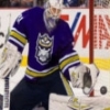
RMiner57 got a reaction from eaglesfan036 in Claimed:The Lanky Latvian: Ivars Klajums [10/10 FINAL]
RIGA, Latvia --- Klajums, #50 makes a pad save for the Latvian U20 international team
Late Blooming
For Ivars, his childhood was a blur. "It was hard. Grew up with four other rascals, and being the oldest you obviously have to be the 'third parent'. My dad worked out in a mine and my mother had the least envious job, taking care of us. We weren't well off, but life was okay. I worked as soon as I could, and tried to do my best with my work and schooling." For him, at the age of eleven is when he learned he loved hockey. He moved to Canada with his parents so they could pursue further work. They settled down in Smithers, BC. "Down the block the kids set up games pretty much every other day of street hockey, I was a pretty shy kid so I just watched, but my dad came home with a hockey stick and it just happened from there. I played D the first time I think, I was so bad that they, kindly, persuaded me to go into the net. I was pretty terrible, as you can expect."
For him, it was his best friend, a kid he met from his school that helped him get better. "At first I wasn't a huge fan of hockey, but I visited his house all the time," he recalled his times with a laugh, "He was a rabid Canucks fan. I believe that's the season when Luongo was traded from Florida to the Canucks, and watching him was astounding. He was a stone wall, and I started to model him when we played. Without padding, may I add. Lots of scraped knees." He wouldn't get into organized hockey until he was fourteen, starting first as a defenseman.
He only played goalie at the age of 16 when he subbed in for his local junior team when their goaltender came down with the flu. "I think it was kind of natural. I was a defenseman and I'd always wanted to try goaltending on ice." He remembered a very lost locker room as he recalled his first game on the ice in an exhibition as a wide eyed rookie with a smirk, "We all had fun with it. A few of the vets on our team had left so we knew it wasn't going to be too great of a season. I think the score was around 8-2." He chuckled while remembering the game, "8 goals may be generous."
Though that season he turned out a sub-.900 SV%, he felt he had a strong season afterwards, playing a few games as their de-facto backup from then on. "We nearly made the playoffs but lost two straight at the end and ended up missing. But I learned a lot. And I matured a lot," When I asked him about his decision to join the Victoria Royals he said, "It was another one of those big moves for me, but not as bad as moving from Latvia to Smithers. It was a lot larger of a town." In the WHL is where the young Ivars really made his mark. Posting a .932 SV%, 1.74 GAA in the WHL, the 114th overall CHL Import Draft selection was named to the J20 Latvia team and continued to prosper in his campaign. He has continued on his torrid pace in his second season in the WHL, posting a .962 SV% and a .84 GAA in his first 8 starts.
He has expressed interest in the VHLM and has since been on Waivers with the Bern Royals already in line to claim him, "I certainly feel lucky. There's a lot of goaltenders in that league and it certainly provides a logjam, though I see an opportunity in Bern to really make an impact right out of the gate and that's what excites me. They're a pretty good team, though they're obviously missing the two stars they traded. I hope I can step in and turn it around, or atleast make an impact. I'll probably have some struggles out of the gate and I'll have to accept that, but I feel through my experiences I can add something to the team." When I asked him about the draft he told me that he wasn't worried about it, he has his first game in the VHLM to take care of. From there, who knows where he'll go.
Player Assessment
Pros
Size The first thing you see when you watch Ivars is clearly his size. He stands tall at 6'4", and he uses his big frame to his advantage. He keeps his shoulders high and his legs far apart so his lower half looks wide and his upper half looks tall. In this sense he is a pure butterfly, but his fast reflexes allow him to cheat up a little to take away the top half of the net and leave his five hole open a little only to shut it quick with his pads.
Positioning Klajums understands the game extremely well, following the play and predicting the play in a way similar to NHL goaltender Ryan Miller. This allows him to recognize what players are about to do, often making cross-crease plays look easy and taking away rebound chances by recognizing where pucks are going and why they're put there the way they are.
Reflexes Just as he reads the play well, he reacts to the play well. Some around him say that he sees the game a second faster than the average player, and he's very agile with his pads, glove and blocker. He maneuvres the crease very well with his strong, springy legs and most pucks along the ice don't pass through him.
Cons
Discipline He is a slow starter to both seasons and games, his 1st periods are reputably his worst. Sometimes he is on and off during games much to the frustration of coaches, but one thing that goes his way is when it's a close game or a pressure situation, he usually seems to shine. When he is at his best he is in a light, humorous mood, and sometimes even dances to the game. When he is at his worst he lets stinkers frustrate him and that often leads to more stinkers.
Glove Side As with many pure butterfly goaltenders, he sometimes cheats low too much and lets in a high side glove shot that shouldn't get past him. Good shooters sometimes pick him apart and that's when you'll see him struggle most.
One-on-Ones He is an atrocious shootout goalie, and he's not too great in breakaways either. He comes out far and sometimes if he cheats on a movement by the shooter he's unable to recover. He's prone to try the flashy save and sometimes he could stand to simplify things on a breakaway.


