.png.ed69a7260a477fcf4feead7a0e4b7506.png)


Jubo
-
Posts
2,470 -
Joined
-
Last visited
-
Days Won
8
Content Type
Profiles
Forums
Events
Articles
Posts posted by Jubo
-
-
Big move, not sure if we ever played together @Peace
Welcome aboard for hopefully a nice final run for Killinger. -
1) Do you think you have been performing up to your expectation this season so far?
Close but not quite enough multi-point games to get Vaak to where he should be among the leagues elite.
2) Who do you think will lead the league in points by the end of the season?
Looks like Reno (Aloe Dear) has it locked down.
3) Right now we are sitting 3rd in the European Conference. What are the odds we catch London (3 points back), or even Warsaw (10)?
Warsaw is out of reach, London we can reach but it looks more doubtful as the season moves along. Nothing wrong with 3rd, just need to fend off Prague and Malmo.
4) What is more impressive in your mind; league leading goals for or goals against?Neither, goal differential is where its at.
5) Would you rather lose 10 games in a shootout, or win 5 in regulation and lose 5 in regulation?
Win 5 and lose 5. Single point games just don't add much of anything to excitement or hype
7) What is your biggest hockey-related fear?
Career ending injury like a severe concussion.
-
-
-
-
-
Review:
Nice to see a different form of media on here. Cool touch adding audio from the draft and the end graphic featuring the player graphic.
Hard to review properly without seeing many videos on here but this was a refreshing watch. Hope to see more of these from you in the future.
9/10
-
1) What are your personal goals for your player this season?
Score big goals, make great defensive plays and help keep the team in the run again this season.
2) What do you think are some achievable team goals?
Make the post-season and fight our way through each round
3) Who has the absolute worst dance moves on the team?
Whoever has a lingering injury that day
4) Who are you rooting for in the NHL playoffs?
Colorado is my pick to take it but I am enjoying the run Montreal is on
5) What is your opinion of fighting in hockey? Not enough, too much, or just right?
It has its place in the game still but will trend less and less as the game focusses more on speed and skill. Fights will always happen, you cant take the passion out of the player.
7) What is your favorite thing you have ever created in the VHL?
Each pre-season roster reveal article within the titans forum LR. Seemed to always get everyone pumped in and bought into the season ahead.
-
-
-
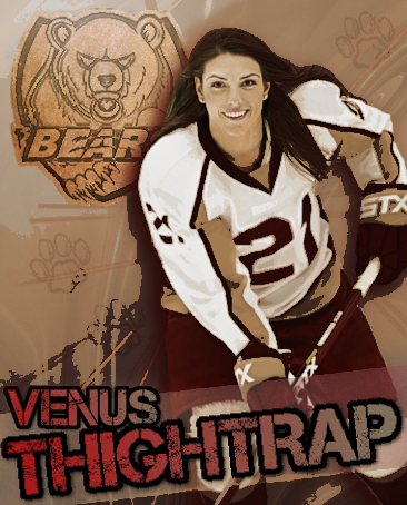
1) Who do you view as our biggest rival right now? I would say Seattle. Venus Thightrap is a powerhouse!
2) Predict the next time we will win a cup: Season 79 or 80, but don't count us out this season.
3) Favorite kind of soup? Minestrone
4) If you had to get rid of the whole team except one person, who would you choose to keep? hmmm, I would go with our best young player so the organization would still have someone to build around. Not naming names lol.
5) What is better, regular season MVP and no cup, or a cup? Not even close, gotta be winning a cup.
6) Give me your favorite LR moment as a Titan so I can get to know the squad! Each and every season during my 9 seasons as GM. So many great members and memories.
-
Review:
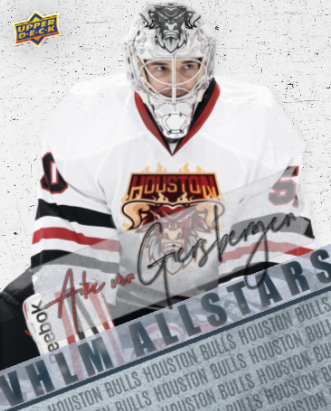
Simple and clean done quite well. Noting the team the player is on would be a good addition but this sig can be used through Atreides career if he so pleases. I like the cursive contrasted text choice for the first name which achieves added character to the graphic. Perhaps a tad too simple and no logo work so I will rate 7/10. -
Review:
Really excellent work here @enigmatic. I can't say I am every disappointed seeing one of your graphics. This is certainly no exception. May not have won by popular vote but it was a top notch submission! Great choice of text, conveyed movement through the graphic and contrast against the dark background. 9/10!
-
This is hot. Love the throwback. Thanks @BladeMaiden!
-
-
1- the playoff hype was strong, enjoyed sharing the excitement with great teammates
2- Spaz still sneaks in and takes the spot beside vaak lol
3- very important each and every season
4- love a nice soft pretzel
5- play Mario Kart on my phone
6- started playing wow classic
-
F - Christian Mingle
F - Venus Thightrap
F - Isabella Campbell
D - Roque Davis
D - Chris Hylands
G - Rara Rasputin -
Review: Could not have better captured Jim Bob in his natural environment. This is different from anything I've seen, and I really respect that. Very appealing to look at and conveys the feel of that crunching body check from one of the leagues most lethal two-way forwards. I gotta give the 10/10 here.
-
-
Minnesota GM
in VHLM
Excellent choice! Watching this guy climb the ranks has been an honor.
Congrats @PatrikLaine- diamond_ace, Laine and BladeMaiden
-
 2
2
-
 1
1
-
-
-
-


Lynx sig
in Archived Graphics/Videos
Posted
Review: Pretty good job here. A simple graphic but I do like the clean look and the effect applied to the image. The logo swap looks flat and is a bit on the smaller side. The text is simple as well but the color chosen works with the overall graphic. 7/10.