.png.ed69a7260a477fcf4feead7a0e4b7506.png)

gorlab
-
Posts
8,645 -
Joined
-
Last visited
-
Days Won
36
Content Type
Profiles
Forums
Events
Articles
Posts posted by gorlab
-
-
Are you elite at graphics now, years later?
-
gj rory
-
-
On 5/1/2021 at 6:20 PM, Telkster said:
Telkster I am here to review your graphic and there are a few points I will highlight, some good, most bad.
good:
- I like the composition of the image. The player render overlapping the team logo in the background gives the elements interaction.
- THe font selection isn't too bad.
- The background texture and font colours both work well with the malmo logo.
bad:
- Render needs lots of work, specifically in 2 areas:
1) Logo swap. The existing AK BARS logo is clearly visible below the nighthawks logo. You can use a tool called CLONE STAMP TOOL or HEALING TOOL (or combination of both) to replace the AK BARS logo with green fabric texture found around it on the jersey. (you CLONE the green jersey texture ontop of the ak bars logo, hiding it)
2) Lack of color change on the red. You can fix this by applying a HUE/ADJUSTMENT layer ontop of the render, sliding the 'hue' slider until the red in the jersey turns blue (the rest of the colors of the render will be all wonky) but then you just apply a LAYER MASK to the hue/adjustment layer, click on the layer mask, press CTRL+I (invert) so the mask becomes BLACK, and then use a WHITE BRUSH to paint on the layer mask, only revealing the "red" parts of the jersey, which will then make them blue.
- Cut is a little bit rough on the render. There are edges, especially on his jersey, where you can see the previous background (white specs) and the only real way around this is taking the time to zoom in with a layer mask OR eraser tool, and erasing those white bits. It takes time, but makes a difference in an end graphic.
I feel like this is enough for a review, but there are other elements missing like render effects, cohesive lighting/shading throughout the entire graphic, and the fact it's a weird 1280x1280 square that really has not much of a use, besides the tpe bag, which you have done enough to secure.
5/10
-
On 4/28/2021 at 6:40 PM, JB123 said:
I called it "Logo Update" but wasn't a logo once I got started.
I'm going to review your graphic here. Despite being the god of VHL graphics, I have no official power to approve/deny graphic PTs.
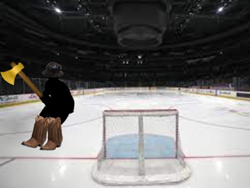
From one perspective, this graphic is absolutely awful. It's a very low resolution hockey rink picture, with a weird silhouette of a man, a video game axe, two cowboy boots, and what looks like a miner's helmet, pasted on top of the rink. The perspective makes no sense, and there's no techniques used to make it seem like that.... monstrosity.... is actually on the ice doing something. Many people would reject this quality of graphic, because there is no quality whatsoever. The best thing I can say from a technical perspective is that you pasted the miner's helmet / axe / cowboy boots in a way that sort of makes it look like that black silhouette is wearing them. This type of execution could be commended if the artist was between the ages of 5-7. Otherwise, it's very rudimentary and basic.
From my personal perspective, despite how horrible this graphic is on a technical level, the absolute absurdity of it is very interesting. I find myself wondering what kind of person decides to make a graphic for a sim league, and ends up with this as the result. Are you submitting this with the delusion that it's somehow nice/good? Are you submitting this knowing it's laughable and as a troll/meme? The existence of this graphic brings up so many internal questions, and at the end of the day, is the aim/goal of art NOT to provoke thoughts and questions from the observer? This is the dilemma that exists with sim league graphics and allows for so much interpretation.
So, despite someone else considering this graphic to be low-effort / not approved, I take the opposite stance, but will warn you that strange/odd low-effort graphics only will go so far and that eventually people will deny you the tpe associated with the graphic.
2/10
-
-
-
- Well. That was awkward. What went wrong?
I hate to take the blame, but I forgot to make any good memes like I did when we won the cup last season. I feel like this was the downfall for us. Counting went good, but the memes did not.
- Who's the first person you're going to take golfing, now that we're not playing hockey?
I am going to take R to the golf course for a nice relaxing round of 9 holes and maybe a few soda pops in the clubhouse afterwards.
- We have a lot of unrestricted free agents this season, who would you like to see re-sign and make a return?
I am looking forward to the dynamic defensive duo of L and R returning to play for Chicago next season and beyond. Otherwise, idk, Nyko?
- Chicago doesn't pick until the 3rd round this year. Do you think we'll be able to uncover some hidden talent with our late picks?
I think so. I did some scouting work earlier this season and told blazzy to write the names down. We should have at least like, 3 names written down. Hopefully they are still there in round 3.
- It's almost the offseason, which means it's almost vacation time. Where will you be spending our time off, in our COVID-free simulation world?
I will be spending 2 weeks in Jamaica having fun in the sun and enjoying the beach and cultural practices of the region.
- Who's the funniest teammate you had all year, and why?
Tough call... It's a toss up between Mingle, Socks, and Xin. They are all pretty funny most of the time and Oferson ain't that funny at all tbh.
-
-
-
-
-
-
-
-
-
-
-
wot in tarnation
-
-
ctrl + f

- Prout, Sixersfan594 and Dom
-
 3
3
-
-
-


rory 1000 post party
in The Thunderdome
Posted
Is there going to be chips and pop?